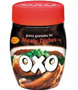
New Pearlfisher identity floats Oxo gravy boat

Pearlfisher has poured out a fresh identity for Oxo’s family of gravy granules, comprising graphics and pack structure, to help the iconic ingredient brand show it offers more than stock cubes.
The new-look products, including ‘standard’, ‘everyday specials’ and ‘with a hint of’ variants for chicken, vegetable and meaty dishes, aim to encourage consumers to use gravy on a greater range of meals.
‘[People think gravy is] only for Sunday dinners and Monday left-overs’, explains Roisin McCart, Oxo gravy and innovation senior brand manager.
Despite its prominence in stock cubes, Oxo gravy ‘didn’t have a role in the marketplace’, she adds, with consumers regarding it as ‘a poor number three versus Bisto and own-label ranges’.
Pearlfisher’s brief was to create an identity that would boost awareness of the brand, as well as increase usage, McCart explains.
The group has introduced plastic, lidded jars with a ‘feminine, pot-like structure’ to give the products shelf stand-out, presenting them as ‘luxury offerings’ among a sea of gravies packaged in ‘masculine’ tubs and cardboard boxes, says McCart.
According to Pearlfisher senior designer Maria Fletcher, shots of home-cooked meals such as steak and sausages start ‘people thinking about all the things they could make using them’.
The Oxo logo is writ large across the pack to communicate the brand’s heritage, she adds.
However, the packaging’s colours have been tweaked to make for a subtler blend. The reds, greens and yellows are ‘fresher and warmer’, says Fletcher.
Pearlfisher won the work, worth a five-figure fee, in July. The group previously worked with Oxo parent company Campbell Grocery Products on Batchelors Supernoodles.
Fletcher was creative lead on the project and the work is rolling out at supermarkets nationwide this month.
-
Post a comment


