Wolff Olins gives child abuse charity Thorn “optimistic” rebrand
The global design consultancy’s New York office has given the charity a new visual identity, in a bid to help its mission of protecting children from sexual abuse online.
Wolff Olins’ New York office has rebranded charity Thorn, which aims to protect children from sexual abuse online and trafficking.
The charity was originally founded in 2009 by Hollywood actors Ashton Kutcher and Demi Moore as the DNA Foundation, to represent the co-founders’ names. Its name was changed to Thorn in 2012.
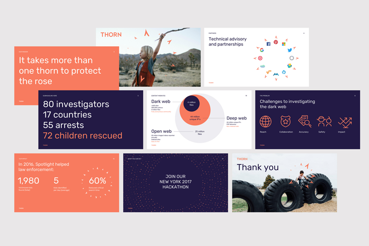
Thorn works with non-profit organisations (NGOs) and tech companies such as Amazon and Google to build technology that uncovers existing online, illegal and abusive material such as child pornography, and also prevents new material spreading. It also aims to prevent and stop sex trafficking networks. The charity works with 20 NGOs and 40 tech companies internationally, and 5,000 law enforcement and police officers in 18 countries.
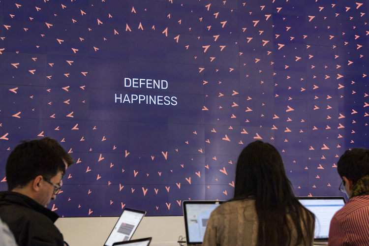
The rebrand is the result of a six-month project completed by Wolff Olins, and was built around a new charity manifesto of “Until every child can be a kid”, which aims to “restore the basic right of a child to be safe, curious and happy”, according to the charity.
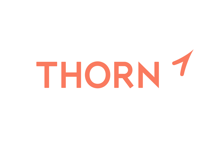
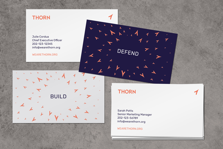
Visually, the brand now aims to be more “optimistic” and pro-active, says Wolff Olins creative director Cynthia Pratomo. It features a flat, line-drawn symbol of a rose’s thorn, an all-caps, sans-serif logotype and a core colour palette of orange, navy blue and white.
The rose thorn symbol was chosen to symbolise how the thorn “protects” the flower, says Wolff Olins, and is also featured multiple times across communications to represent “unity, strength in numbers and an active defence”, alongside a sense of community. The typeface for the logo aims to be “sharper and more solid” than the previous one to symbolise “strength”, the consultancy says.
Wolff Olins has also designed a suite of line-drawn icons in the same style as the thorn, which have been used to represent the charity’s challenges in brand strategy documents. This includes an icon of a child and a parent or guardian to represent “safety”, a globe to represent “reach” and upward arrows to represent “impact”.
Accompanying imagery and photography is minimal and “intentionally pared back”, because of the sensitive nature of the subject matter, Wolff Olins says.
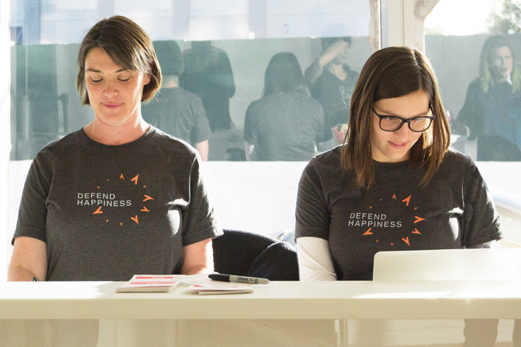
The new branding is currently rolling out across online platforms, print and marketing materials, merchandise and Thorn’s office interiors.


-
Post a comment


