Loewy simplifies Revlon packaging
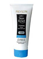
Loewy Group has redesigned the packaging for Revlon’s range of dry skin relief body lotion, moving away from the previous functional product shape to a more aspirational image.
The design, which launched last week, gives greater prominence to the Revlon name and employs the brand’s traditional gold and black colours. The previous packaging was ‘off-white’ and had the name running up the side of the bottle, says a Loewy spokeswoman.
‘It used to look like a shampoo bottle, very functional and masculine,’ says the spokeswoman. ‘Loewy was asked to position the range as an everyday pampering product – a much more glamorous proposition – to appeal to 25to 35-year-old consumers. The result is an ownable brand identity that stands out on the shelf and communicates Revlon’s core values.’
Revlon is looking to revive sales in a market led by Nivea.
Loewy was appointed after pitching against Lippa Pearce and Dew Gibbons. It was the first time the New York-based Revlon has budgeted for a UK-only design project. ‘We have gone for a clear, simple approach,’ says the spokeswoman. ‘Perhaps UK consumers appreciate more understated design.’
The re-vamp was overseen by Loewy creative director Chris Vane.
-
Post a comment


