Design Bridge packs help Hovis evolve Big Food style
RHM is relaunching Hovis, part of the Bread Bakeries division, with a revised identity and packaging developed by Design Bridge.
The redesign evolves the iconic ‘Big Food’ pack designs created by Williams Murray Hamm, in an effort to make it easier for consumers to make choices across variants. WMH helped revitalise sales of Hovis four years ago by placing images of baked beans, cucumber slices, tomatoes and eggs on packs. However, the consultancy resigned the account in 2003 due to differences on how best to take the brand forward (DW 24 July 2003). Design Bridge was drafted in to refresh the brand six months ago.
The consultancy has reworked the Hovis master brand identity and created new-look pack designs across the Hovis Premium and Super-Premium ranges.
The wheat sheaf on the Hovis logo has been replaced with a more contemporary and stylised typeface. It features a deep aubergine coloured background with an arc of gold at its base to represent a rising loaf of bread.
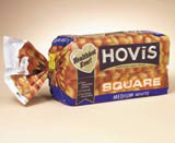
The redesign aims to give greater clarity to packs, introducing easier consumer navigation of the range and greater sub-brand differentiation. For the Premium range, different coloured bands have been introduced across the base of packs to denote thickness and sub-brand names have been enlarged and given individual typefaces to reflect the variety of breads. For example, a squared typeface references a square cut loaf; a serif style reflects a wholemeal loaf.
Across the Super-Premium range, iconic images such as a sunflower, a butter dish or bread-bin have been added to denote different sub-brands.
‘There was a job to be done to help consumers find what they were looking for. It was quite tricky to find the right cut of thickness, for example. The designs make it easier to understand the difference between each variant, giving a personality to the sub-brands,’ says Bob Scott, account manager at Design Bridge.
In addition, a new healthy eating communication device has been developed by Design Bridge for use on all Hovis packs, comprising a gold-heart shape and ribbon carrying nutritional messages.
Alyson Ebbrell, Hovis marketing manager, says, ‘There remains a great deal of value in the design themes we introduced in 2001, so we have made sure that the new packaging develops those styles in a consistent and highly impactful way.’
The identity and packs launch this week, according to a spokesman at RHM.
RHM is in the throes of creating a group design roster. It is in talks with a shortlist of nine groups, including Design Bridge (DW 14 April) that it will whittle down to five.
RHM Bread Bakeries
• One of the largest plant bakers and flour millers in the UK
• Brands include Hovis, Mother’s Pride, Nimble and Granary.
RHM Consumer Brands • Specialises in selling and marketing products in the retail grocery food sector
• Product portfolio comprises: Mr Kipling cakes, Cadbury Cakes, Lyons cakes, Sharwood’s Asian sauces, Bisto gravy, Paxo stuffing, Saxa salt, Robertson’s preserves, Frank Cooper and Golden Shred marmalade, Atora suet
Read this next

-
Post a comment


