Macmillan Cancer Support rebrands to attract more diverse volunteers
The charity has been given a new identity by its in-house design team and Dragon Rouge, which looks to encourage those with cancer to “live life as fully as you can”, as well as bring in fundraisers of all ages and cultural backgrounds.
Macmillan Cancer Support has rebranded, with the aim of attracting a more diverse audience of volunteers and conveying the “positive” side of the charity’s work.
The new brand identity has been designed by studio Dragon Rouge, in collaboration with Macmillan’s in-house design team. An accompanying advert has been created by advertising agency VCCP.
Macmillan Cancer Support was founded by civil servant Douglas Macmillan in 1911 after his father died from cancer.
It was originally set up as the Society for the Prevention and Relief of Cancer, based around improving the experiences of those living with the disease.
After several name iterations, its name changed to Macmillan Cancer Relief in 1996, then Macmillan Cancer Support in 2006.
Alongside end-of-life care and support, the charity now offers several services for those living with cancer, their carers, family members and volunteers. This includes physical, financial and emotional support, advice and resources, and online and digital courses and workshops. It also helps fund medical research, puts together reports on cancer and helps to shape Government health policy.

The new brand identity is focused on “positivity” and encouraging those with cancer to “live life as fully as you can”, says Becky King, creative director at Dragon Rouge, given that one in two people born after 1960 in the UK will be diagnosed with cancer during their lifetime, according to Macmillan.
“Macmillan has been associated with end-of-life care rather than the full range of services it provides,” says King. “We wanted to show how it’s also about treating patients. Figures now show that [half] of all people in the UK get cancer, so it’s not about focusing on dying from cancer anymore but about living life as fully as you can.”
She adds that the new brand also aims to change “perceptions” of those who volunteer for and benefit from Macmillan, and help the charity appeal to a more ethnically and age diverse audience.
“There is a perception that it’s all about coffee mornings with middle-aged, white women,” King says. “[The charity felt like] it wasn’t attracting young audiences for its [fundraising and campaigning] events. Accessibility and diversity were big parts of the rebrand.”

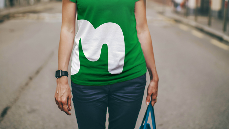
The new identity includes a refined version of the previous logo, which was designed 13 years ago by Wolff Olins to coincide with the charity’s name change to Macmillan Cancer Support. This was a hand-drawn, bubble-style, typographic logo set in green, which read “We are Macmillan Cancer Support” in all-capitals.
The redrawn logo looks to work better on digital platforms, says King, and now includes animated versions as well as static.
It has been “simplified”, dropping the “We are” in all applications to read only “Macmillan Cancer Support”, and the previous palette of three greens has been reduced to one “bright” shade. A secondary palette of yellow, green, blue, purple, pink, red, orange and brown has been incorporated into the rest of the identity, such as in illustrations used on advertising posters.
The Macmillan logotype has been refined – previously, the logo was painted by hand with a brush then scanned in, but now it has been redrawn digitally to remove the brush-stroke style and make it “smoother”, while still “giving it the effect of hand-writing”, says King.
A shorthand “M” has been designed for use across social media and app icons, which is essential as Macmillan “does most of its advertising through platforms like Facebook”, says King.
New illustrations have also been created, which are no longer black silhouettes, but are coloured in and focused on “everyday items”, in a bid to make them “relevant to everybody” and simple to reproduce in-house.
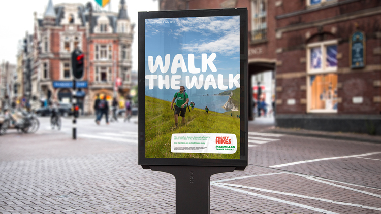
Photography is now less focused on individual people and includes more settings such as street scenes, to “add more life” to campaign materials, says King.
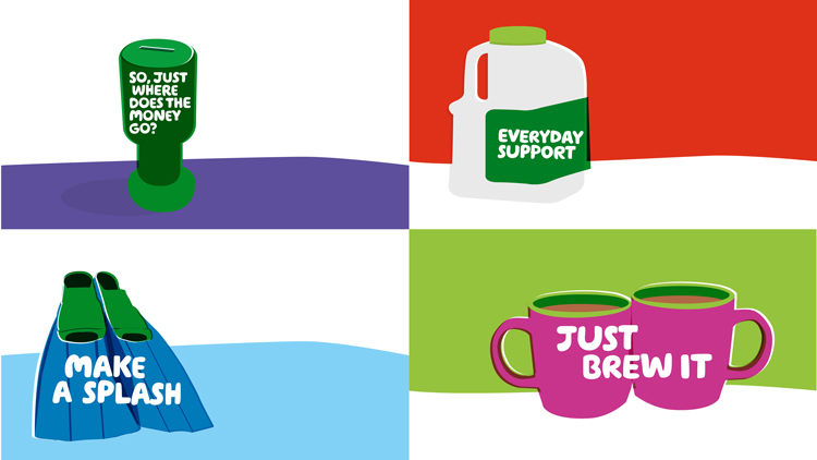
The tone of voice has been adapted, to appear more “positive, accessible and everyday”, adds King, with slogans such as “Run. Bake. Swim. Hike”, “Walk the walk” and “Will you brave the shave?” used to promote fundraising activities.
“[Macmillan] had a big spectrum of tone of voice before,” she says. “They were big, bold and fun sometimes, then very serious other times. Instilling positivity has been a key thing.”
The new brand soft-launched for internal Macmillan staff and communications last year, and now starts rolling out externally as the promotional advert launches this week. The rebrand took roughly a year to complete.

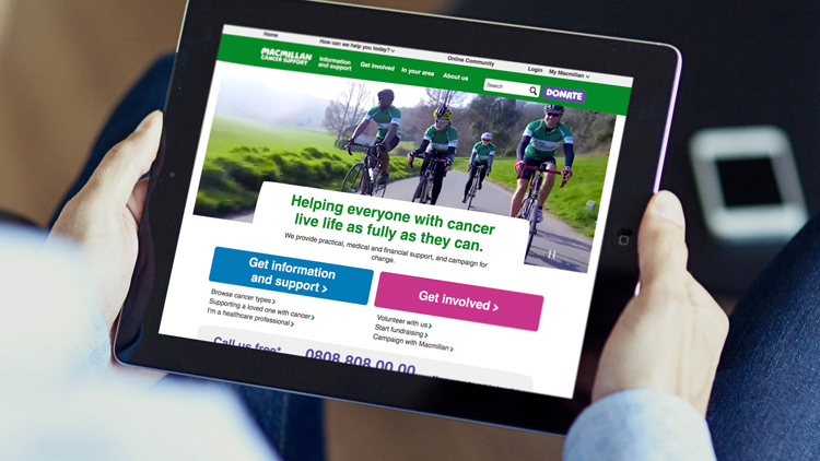
It will roll out across all touchpoints including digital platforms, merchandise, signage at events and print and online advertising. There is a website for campaign templates, where people such as NHS doctors and nurses can download materials such as poster and leaflet layouts. This looks to encourage volunteers, medical staff and supporters to make their own branded materials.
There are currently 2.5 million people living with cancer in the UK, with breast cancer the most prevalent, followed by prostate, according to Macmillan.


‘a new identity / rebrand?’ – Seems wildly exaggerated given its just been ‘tweaked’ at best…