Pack your essentials
Substitute words for packaging may come and go, but Richard Williams believes that ideas-based design, which appeals to our senses, still sells products from the shelves

During Margaret Thatcher’s first Election victory in 1979, much was made of a grocer’s daughter making it to Number 10. In these egalitarian days, why is it that the British view grocers and grocery as, well, a bit grubby? It’s a world that we designers simply don’t inhabit comfortably.
That’s probably why we are a bit sniffy about packaging. It’s not quite us. The lush world of the corporate boardroom, consulting for the movers and shakers is where we naturally feel at ease. We’re so ashamed of packaging that we’ve even tried to re-christen it brand communicationsà or on-shelf presence – some daft git even called it “product uniform”. In reality, we are lumbered with the “P” word and destined forever to be the recipients of unwanted bottle samples and subscription demands from Flute and Palletisation Monthly.
In spite of the huge threat to its very existence from the environmental movement and the chinless wonders in the City of London being seduced by nerdy school-leavers, ending up valuing MyScoutTent.com more than Unilever, Mars and Proctor & Gamble put together, packaging has never been healthier. Whyà you might ask?
Well, “chinless” lost his shirt and has reverted to defensive stocks. Suddenly the brands we know and love, can feel and see, are back in favour in a big way and confidence has returned to the market. Selling products from the shelf, rather than on-screen, is no longer unfashionable, but things have changed.
There is a new breed of entrepreneurialminded, enlightened client in marketing who hasn’t been inculcated with the view that packaging is a mere support act. Instead, they see it as the very engine of a brand’s being. They don’t see the old stalwarts of logo size, ownership of a colour and appetising food shotà as being the way to reach the hearts and minds of a jaded shopper. Increasingly, they understand that ideas-based design for packaging is much more effective, because it delivers what my first boss called, memory retention value – now cutely called “brand cookies”. These are just like those little “cookies” on your computer that, uninvited, drop on to your hard disk, once you’ve been on a website. Similarly, “brand cookies” are the messages that your brain stores once you’ve seen a pack and power up each time you encounter the brand. Of course, if the pack looks like everything else on the market, you’ll just filter it out like any noise that doesn’t mean anything, but strong ideas are never forgotten.
Here’s a test to prove the point. What is (a) the milk drink that looks like a cow? (b) the pizza brand with a big pizza on? Answer: (a) Frijj and (b) any old pizza.
While design consultancies have been involved in packaging for decades, we seem to have only just started to explore what it really can do. In this time-starved world and with the quest to strip costs out of every part of the process, both designers and manufacturers have forgotten the tremendous importance of the human senses, of ritual in the consumption of a product and of the power of words. These remain the ignored gems of brand packaging.
The moment you pick up a product your fingers send messages to your brain about how much it weighs, its temperature, what the packaging is made of, the surface texture and what form the product takes. Such is the sensitivity of the human finger that you don’t even need to see the product to sense its value and its purpose. In the rush to mass production we’ve forgotten our senses. I believe that during this century, production will focus around tailoring mass-market products to meet our individual needs and we will demand that packaging reflects our mood and needs at any one time. This mass niche-marketing will place great demands on the designer to understand how packaging can best reflect mood and emotion.
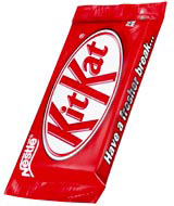
Neither are we exploring the use of ritual in product consumption. How do you unwrap a Kit Kat? How do you break it, do you run your fingernail down the silver and snap off one or two fingers? Do you share it? What about Jaffa Cakes? Do you secrete the orangey bit in your cheek, how big are the bites you take? These are classic ritualistic products, which most likely came about by accident, but think what a sense of difference can be achieved in most sectors by enhancing the joy of opening and using a product. In a bid for what I am sure is cost-cutting, Nestlé has repackaged Kit Kat in a flow wrap. This is nothing short of a crime in my book.
Think too about words and tone of voice. Every human has an individual voice and intonation, so why don’t brands? We have the chance to create inextricable links between how products look and what they say.
I have a strong sense that packaging design, as a way of connecting with consumers, has a very bright future. As long as people choose to buy products from shops for themselves and those they care about. Then it will be a key discipline for people involved in marketing. The key is to unlock its true potential.
Richard Williams is managing partner at Williams Murray Hamm
-
Post a comment


