Trackinsight rebrands as an “oasis of calm” in the investing world
The ETF analysis app’s new identity and refreshed app experience hopes to provide customers with a “welcome respite” in a busy sector.
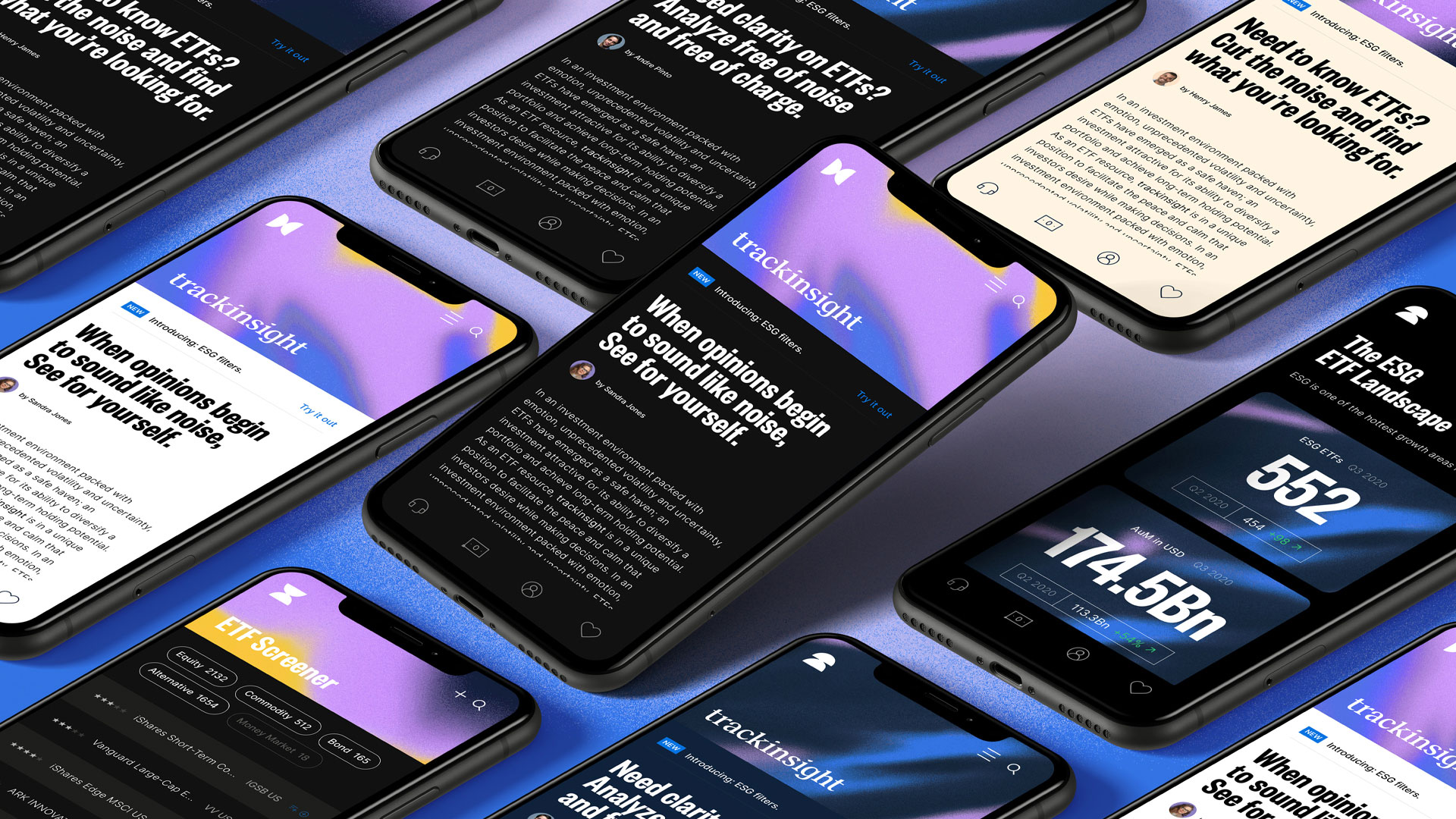
Design studio How&How has rebranded exchange traded fund (ETF) analysis app Trackinsight in an attempt to cut through the “noisy world” of investing.
How&How – which is based in London and Lisbon, Portugal – has designed the company’s new identity which rolls out on the Trackinsight app, a series of animations and promotional material.

Trackinsight was established in France in 2014 and compares ETFs across North America, Europe and Asia. ETFs are similar to the more common mutual funds, but are traded throughout the day on the stock exchange, rather than at the start and end.
The app has partnered with the Financial Times newspaper and is seeking to expand in the US, which was an important consideration in the company’s rebrand, according to How&How creative director Cat How.
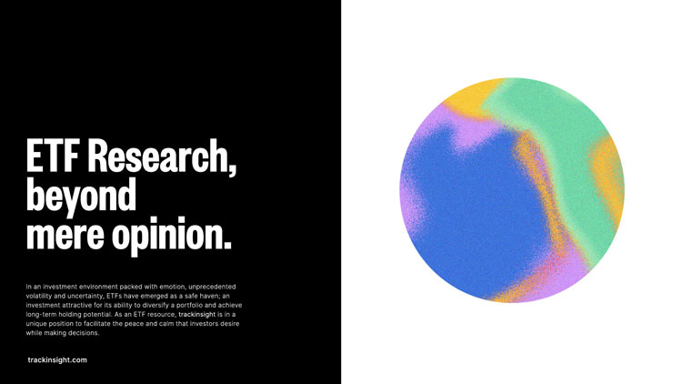
The studio’s aim for the rebrand centres around an “oasis of analysis”, says How. “As a data-driven ETF resource, Trackinsight was in a unique position to facilitate the peace and calm that investors desire while making decisions,” she adds.
The new wordmark is inspired by reading glasses, as a nod to how the app hopes to help its users to see better. The lens shape appears as the modified tittles on the two ‘i’s.
This visual influenced the colourful graphic elements of the branding. Grainy gradients are “cut-through with razor-sharp graphic elements”, How says. These were later evoked in three-dimensional glass lenses as well.
How&How has used a 1980s-inspired colour palette for the rebrand, comprising canary yellow, lavender and pea green as well as blue and black tones. When the UI switches to a dark mode, some of those tones switch – such as navy blue to cream.

The studio has developed a kit of animated illustrations, which includes a balloon and apple icon, and also uses the 80s-inspired graphic pattern.
Promotional material, both OOH and on social media, incorporates the identity’s themes of clarity amid noise. Taglines include: ‘Focus in the noise’ and ‘Lose the noise, reach for clarity’.
Because of Trackinsight’s partnership with the Financial Times, the studio chose Founders Grotesk as a typeface for its “strong editorial vibe”, How adds. Inter has been used for UI.
An updated tone of voice is in place, which places an emphasis on an editorial and approachable feel.
How says: “Just as the brand’s gradients simultaneously represent the antagonist (noise) and the proposition (an oasis), the messaging across audiences was as much about removing negatives as it was proposing positives.”
What do you think of the rebrand? Let us know in the comments below.

-
Post a comment


