Designing Northern Ireland’s new vertical bank notes
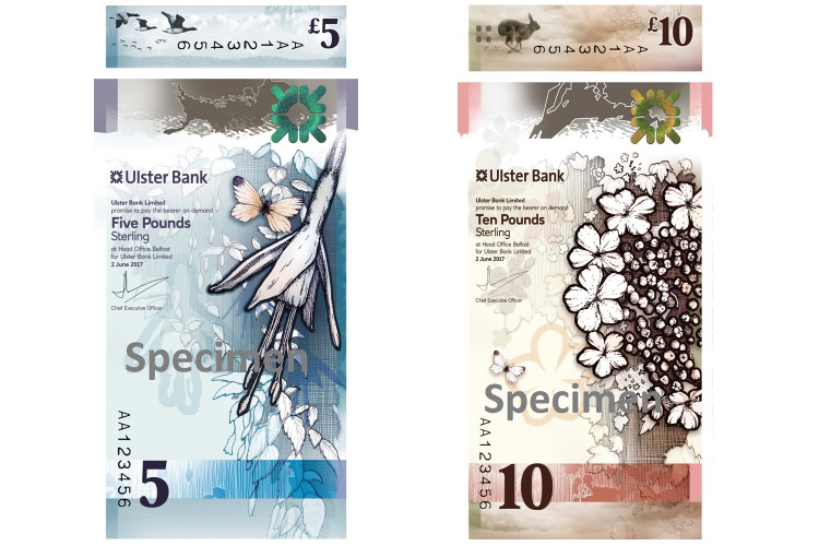
Polymer £5 and £10 notes issued by Ulster Bank will enter circulation in 2019 – we speak to Nile, the design studio behind the new notes, about celebrating migration, indigenous species and Northern Irish culture.

The UK is increasingly becoming a cashless society – people are now able to tap away on contactless card readers on public transport, in bars, restaurants and pretty much anywhere.
The use of physical money is naturally declining. Research from UK Finance conducted earlier this year found that debit cards are set to overtake cash as the most frequently used payment method in the UK. No doubt the appeal of paying with card is not only its convenience but also security and the ability to track spending at every point.
But while we still have coins and notes, banks across the UK are concentrating efforts on introducing more secure currency, which is harder to counterfeit – as well as implementing thoughtful designs that resonate with the public.
The Bank of England is not the only UK bank to do this. While English currency might be the most widely circulated, Scotland and Northern Ireland also produce their own bank notes, which can be used across the UK.
Ulster Bank in Northern Ireland is set to release polymer £5 and £10 bank notes, which are made of polymer like the recently-released English and Scottish ones, and have a vertical design.
The notes have been designed by Edinburgh-based service design consultancy Nile, in collaboration with creative directors Lisa Smith and Colin McCadden, and several Northern Irish illustrators and photographers. They feature plants, animals and themes that relate to the country. Type foundry Fontsmith worked on the typography, while Glasgow-based design studio O Street worked on the graphics and banknote manufacturer De La Rue worked on security features and printing.
Jeni Lennox, associate principal at Nile, says that the decision to take on a vertical format was based on a few reasons, including breaking tradition and allowing more space for illustrations.
“Firstly, we thought – why not?” she says. “Orientation of notes is a convention and designers love nothing better than to question convention. We did develop notes in both orientations and found that the vertical design gave more space for the flower illustrations, helping them sit more prominently on the note.”
“Also, notes are handled both ways round nowadays, particularly when being fed into machines, so we wanted to acknowledge this,” she adds.
She adds that the designs aim to be “honest, realistic and celebratory” of Northern Ireland’s characteristics and quirks, and that the studio wanted to avoid clichés associated with the country. Nile redesigned the Scottish notes in 2016 and 2017, and avoided “castles and tartan” for the same reason, she says.
From this way of thinking came the idea of representing the decline of segregation in Northern Ireland – namely between those who belong to the Roman Catholic and Protestant churches – and how, while divisions are still an issue, political tensions have gradually improved over time.

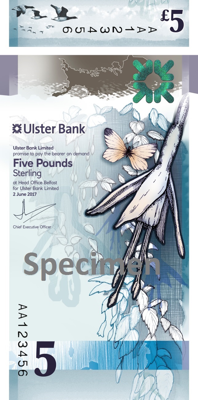
The £5 note is themed around migration of animals and people, and features native creatures and plants on the front, including the Brent goose and the fuschia flower. Hedges also feature, which aim to represent the idea of “porous dividers”, and symbolise divisions between different communities breaking down, says Lennox.
The back features the Strangford lough sea loch found in County Down, east Northern Ireland, as well as people running down the beach, which poignantly represents the country’s history of migration and family separation, as many Northern Irish people moved to America and Glasgow in the 20th century.
Then, when a UV light is shone on the note, another set of people appears, which looks to represent these families coming back together again as this period has passed.

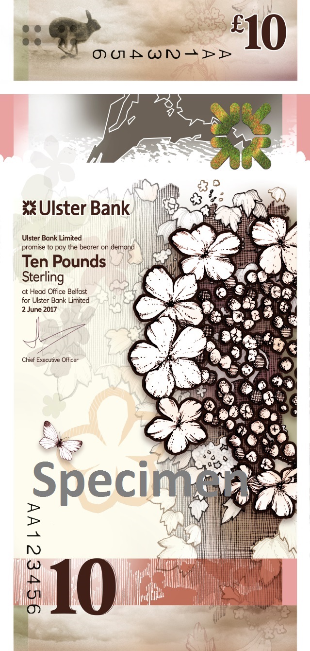
The £10 note is themed around growth, and celebrates Northern Ireland’s traditional food and indigenous plants and animals, featuring a guelder-rose on the front alongside an Irish hare.
The back features an Ulster glade potato, which only appears under UV light, and hedge row fields across which ploughs are being pulled for farming.
Different textures feature on the notes for security purposes, and these are also related to the country’s geology – a greywacke sandstone texture features on the £5, while carboniferous limestone features on the £10.
Both notes have a “botanical” theme, and the colour palette broadly follows UK restrictions for currency, which are blue and green for £5 notes and brown for £10 notes.
The studio will also be designing a £20 and £50 note, which will take on more of an “urban” theme, while the £5 and £10 notes are more “rural”, says Lennox.
The design team employed a roster of Northern Irish creative people to work with. Botanical and plant-based illustrations were created by Abigail Bell, while illustrations of people and other features were created by Peter Strain. Some features were also based on work by landscape photographer Chris Hill.
“We went for an illustrative, soft style, and we wanted the notes to be anonymous rather than have specific people’s faces on,” says Lennox. “We gathered this in the consultation phase.”

The note designs are also pertinent given the UK’s decision to leave the European Union (EU) – the fact that Northern Ireland voted to remain was an important consideration, Lennox adds.
“We wanted to make sure [Northern Ireland’s] identity was preserved and clearly enunciated as a welcoming country through the theme of migration,” she says. “We wanted to stress – we are open and we are friendly.”
While these notes are produced by Ulster Bank, they will be available to use anywhere in the UK – and part of the project was also about stressing how much the country provides for the UK overall.
“It’s easy for the little nations to get lost, but they’re all different and Northern Ireland has a strong voice,” she says. “It pulls its weight and has amazing industries and brilliant musicians. This is just a celebration of that.”
The new £5 and £10 notes will enter circulation in early 2019, and will be legal tender across the UK from then.


No mention of the reasoning behind making the notes portrait, even though it’s mentioned in the title?
Hi Andi,
Noted – we went back to the designers to clarify and have added in some justification about the vertical format of the notes.
Thanks,
Sarah
Very glad to see the original design inspiration of Colin McCadden and Lisa Smyth recognised in this updated piece.
Thanks
Glenn
MD, McCadden
I like the vertical design but they will not legal tender in the UK.
http://edu.bankofengland.co.uk/knowledgebank/what-is-legal-tender/
“The same is true for Scottish and Northern Ireland banknotes. Seven banks in Scotland and Northern Ireland are authorised to issue banknotes. These notes make up the majority of banknotes in Scotland and Northern Ireland and legislation is in place to ensure that noteholders have a similar level of protection as they would for Bank of England notes. Despite this, Scottish and Northern Ireland banknotes are not classified as legal tender anywhere in the UK. Equally, Bank of England notes are not legal tender in Scotland and Northern Ireland.”