University of Greenwich rebrands for better digital presence
The London university has kept its compass logo but made it simpler and flatter so that it can be used more easily across digital platforms.
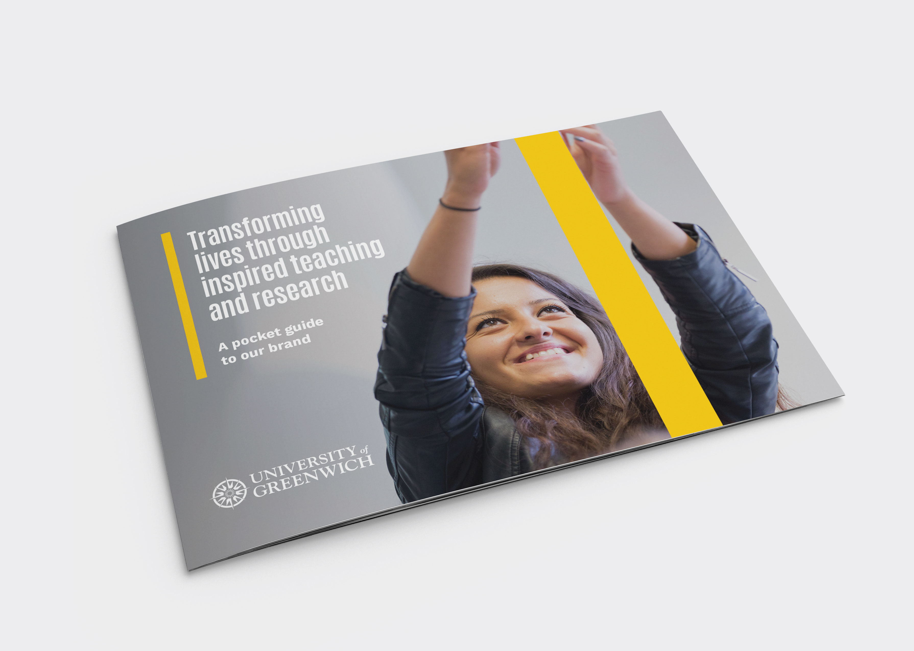
The University of Greenwich has rebranded, revealing a new, cleaner and simpler version of its compass logo.
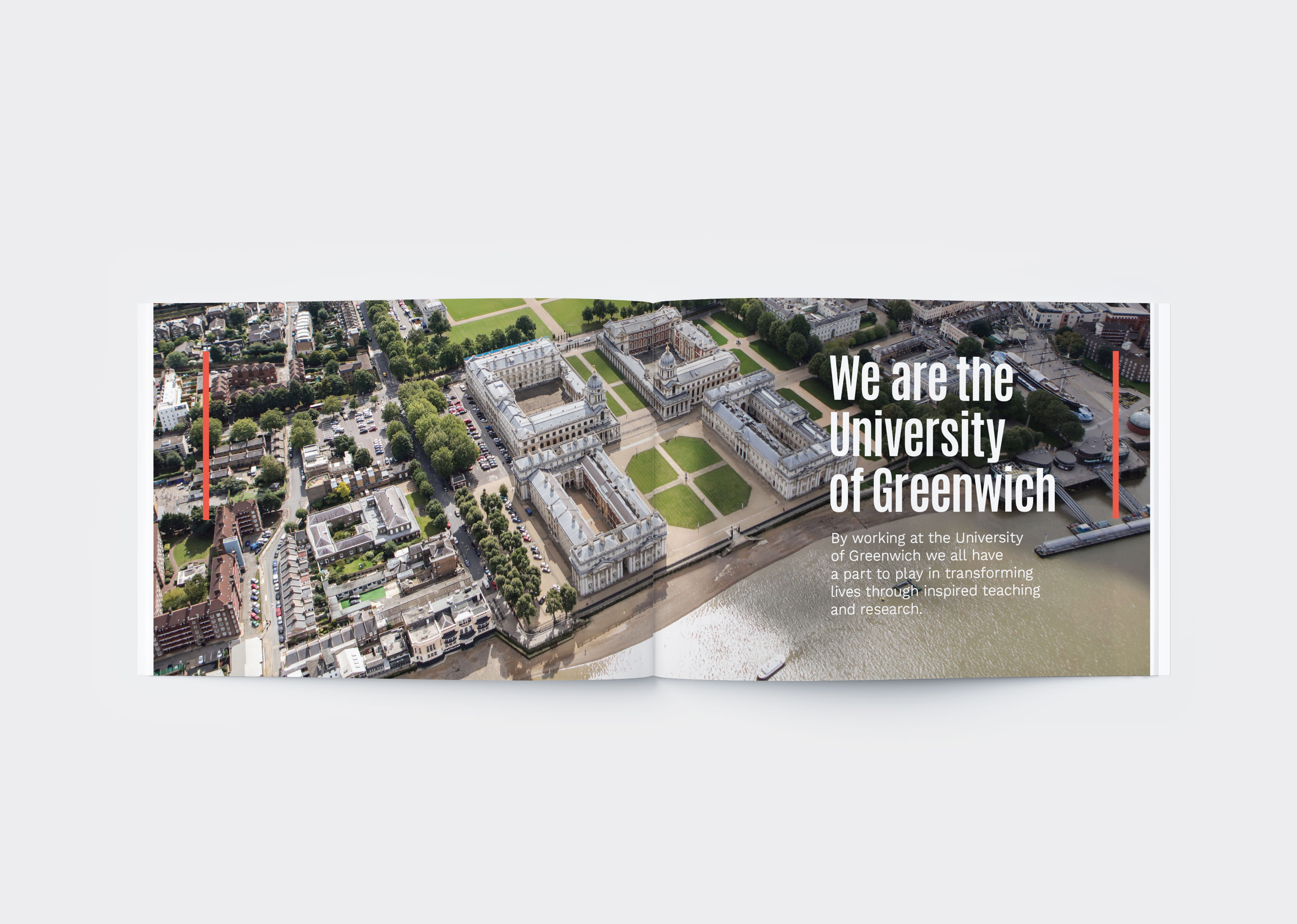
The London university was founded as Woolwich Polytechnic in 1890, then later became Thames Polytechnic in 1970. It was rebranded as Greenwich University in 1992.

Its incumbent logo saw an ornate compass in navy blue, with the words University of Greenwich circling it. It was accompanied by a second application of the university name, with University of Greenwich written next to it across three lines.
The new logo, designed by consultancy Rbl, sees a more minimal, flat compass icon, with less detailing at its centre, and University of Greenwich scrapped from the main logo lock-up. The university name still sits beside the icon, now in a bolder typeface, split across two lines rather than three. A purple shade has replaced the previous navy blue.
The new visual system aims to be more flexible for use across digital platforms, says Adam Concar, head of creative at Rbl, and removes extraneous parts of the previous logo.
“Tidied up”, not “dramatically changed”
“The logo had evolved over time and had collected bits and pieces which didn’t necessarily fit together,” he says. “For instance, it said University of Greenwich twice.”
“We’ve tidied it up, but not dramatically changed it,” he adds. “We wanted to rationalise it and make it work better for a digital landscape rather than throw everything away. We were aiming for something more timeless and with a bit more impact.”
The university’s compass crest was originally inspired by Greenwich’s connections with carpenter and clockmaker John Harrison, who invented the time pieces that helped sailors find longitude at sea in the 18th century.
Involved students in rebrand
Recent university rebrands have caused controversy among students, such as Loughborough University’s refresh last year, which saw students up in arms that the new, more minimal logo would devalue the institution’s heritage. The university subsequently rebranded again.
Concar says that Rbl has seeked to involve University of Greenwich students in the rebrand, by consulting them since the project began seven months ago.
Logo was “warmly received”
“We’ve been talking with the students all the way through the process,” he says. “One thing that came out of research is that the campus is historical but also a really exciting place. Aside from a university, it can be a museum one day or a film set for Les Miserables or Thor the next. So we wanted to create a logo that could change and work across a different range of materials.”
Rbl is yet to receive final feedback from the students, but Concar says the new logo has been “warmly received” and was the “leading contender” throughout the testing period.
The new branding will begin rolling out for academic staff this month as part of workshops, then to students from next year.


-
Post a comment


