Press release
Graphic designers should build a strong working relationship with their printers if they want their work to look as vibrant as possible on the page, says Andy Probert
Looking at how the paper performs, what screens to use and ensuring the repro makes the most of the images is an essential part of producing a book of this nature. ‘Rankin is a perfectionist and creates stunning images, but they can look very ordinary if the printing isn’t great,’ says Simpson.
Below par printing is usually down to bad repro, especially when printing on uncoated papers. In these instances it is essential to adjust screen settings to achieve the right dot gain (the spread of ink on uncoated papers which results in enlarged dots, causing loss of detail on photographic images). ‘There is no point spending six months designing something you are proud of for a printer to destroy [it] in a week,’ Simpson says.
Finding the right printer and establishing a good working relationship is ultimately the key to enhancing printed communications. Printers have all the knowledge, designers just need to tap into it – it is simply a matter of seeing print as an integral part of the design process.
Andy Probert is a director at Design Project in Leeds
Interesting print processes/techniques
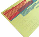
Overprinting – a technique of overlaying transparent colours to achieve multiple printing combinations as well as greater colour density
Super Diffuser Holofoil blocking – an alternative to silver foil blocking that produces a rainbow effect when the light catches it
Light sensitive ink – a litho ink that only reveals colour when exposed to sunlight
White opaque litho ink – an ink that allows white to be printed on to coloured stocks
Thermography – a technique of putting resin on to wet ink that produces a raised, glossy surface
Read this next

-
Post a comment


