The Scotsman looks to appeal to “whole of Scotland” with new design
National Scottish newspaper The Scotsman has redesigned in print and online, alongside swapping its coloured logo for monochrome.
Scottish national news title The Scotsman has redesigned its print, online and app versions, and refreshed its logo.
The new designs, which launched today, have been created by an in-house team for the newspaper’s publisher Johnston Press, alongside Spanish consultancy Errea Communications. The consultancy also completed The Independent newspaper’s redesign in 2011.

The main aim of the redesign was to align The Scotsman with a “modern look”, says Javier Errea, founder at Errea Communications, while appealing to a wider audience.
He says: “We tried to offer a fresh, new look for a prestigious newspaper – we wanted it to be more appealing to urban and sophisticated audiences, both in print and in digital. It was crucial to the keep the spirit of The Scotsman’s strong traditional image, but also use more editing tools and create a modern look,” he says.
The Scotsman’s printed newspaper previously had a navy blue masthead with a green thistle. It has now been changed to black, with a bolder typeface that aims to be more “subtle and elegant”, says Errea.
The headline and body copy typefaces have changed from Coranto and Interstate to Sueca, and Calibe has been applied for text boxes, charts and tables.
Errea says: “Sueca is neutral enough, incredibly legible, elegant and very versatile – it is one of the best fonts in the world for newspaper legibility.”
The placement of the price and date has changed, now sitting at the top of the paper, and brighter colours have been incorporated into text and imagery.
“We’ve used the colour palette as a new tool for navigation both in digital and print,” says Errea. “We went for a more happy, brighter pallete, compared to the blue, quite sad existing one.”
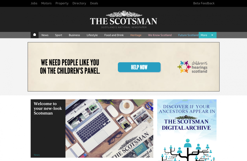
According to Johnston Press, the new responsive website promises to offer “streamlined article and topic pages, faster-loading pages and easier navigation”.
It sees the removal of a navy blue background, and the refreshed logo has been incorporated in white, with a new black masthead.
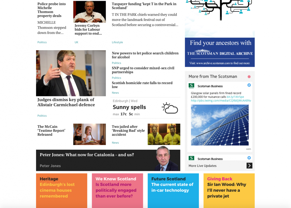
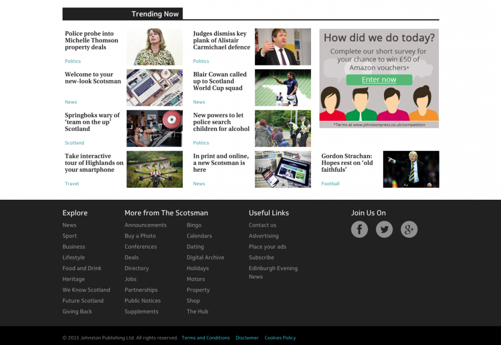
Alongside the main homepage sections of News, Sport, Lifestyle and Business, a new Trending Now section has been added, and Scottish-themed channels have been added to the top menu.
These include Heritage, showcasing historic images and reports, We Know Scotland, based on national information and facts, and Future Scotland, which will look to areas of innovation and growth.
Ian Stewart, editor at The Scotsman, wrote in a statement that the new content aims to provide a “mix” that will “better reflect the whole of Scotland and its multitude of communities”.
The new website currently exists alongside the old site as a beta version. The old iOS and Android app will also continue to run alongside the new one, as it allows users to download the print edition on their phones.
The Scotsman was launched in 1817 in Edinburgh as a broadsheet paper. It was converted to tabloid size in 2004.
Read this next

-
Post a comment


