Letter heads
Using typefaces and grids and adapting letters to make logos are the fundamentals without which no designer can operate.
Unreal
Advertising typographer Tim Lewis started Unreal eight years ago. Since then it has grown to 12 people, including three designers working with Lewis and his creative director Brian Eagle. Eagle is a softly-spoken Kiwi who used to work with Ken Cato (probably the most prominent and well-established designer in Australia). With a client list that includes the BBC, The Greater London Authority and Penguin, Unreal has no problem seeing itself as a typographer.
Eagle’s heroine is Pentagram partner, Paula Scher. ‘She doesn’t care if something she does looks ugly, she cares more that it’s different,’ he says. This is Unreal’s strategy, he adds, to ‘put a lot of fun into the work’ and make it lift off the page and vie for your attention.
A job that exemplifies this approach is one of a series of posters for HarperCollins – launching this month – that feature extracts of interviews with its authors. JG Ballard is asked, ‘What single thing would improve the quality of your life?’ He answers, ‘A time machine.’ Unreal has made a tiny typographic time machine with great economy, flipping a piece of type backwards, pointing it in two directions. It is kind of ugly, but very clever. Scher would be impressed.
Elsewhere, for Penguin, the consultancy designed a typeface for use on billboards and word-driven ads, working with advertising agency Mustoes. It looks innocuous, a simple line of type with each letter of the alphabet, set in a version of Conor Mangat’s Platelet, just like a children’s book. The shock comes at the end: the copyright symbol. It is as if the publisher owns the alphabet itself, holding the rights to all written language. Evidence of the power of this idea is that when the ads bearing it appeared, Penguin had several calls from perplexed publishers and writers thinking the claim to ownership was real.
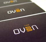
Much of Unreal’s work is identity, either implementing existing brands or devising new ones. A typical example is for direct marketing agency The Oven. Unreal picked one of the fonts of the OCR family, with its radiused rectangles, and redrew the ‘E’ as a curvy heat element. (If you look carefully, you can see the orange line is a drop-shadow to an invisible ‘E’.) A perfect piece of reductive humour, inextricably intertwined with the typography.
Park
Park – which comprises Nina Nägel and Linda Lundin – inhabits an old workshop in a rough-hewn part of London’s Hackney, opposite Perfect Fried Chicken. The pair met at Central Saint Martin’s College of Art and Design and ended up together again as assistants in the studio of former Pentagram associate partner Thomas Manss.
Established two years ago, the group is growing in the old-fashioned way, not by opening offices in Gstaad and Aspen with borrowed money, but through word of mouth recommendations. Clients started out as individuals (in Park’s words, ‘little entrepreneurs’), but they now include furniture shop Twentytwentyone and Selfridges.
Nägel and Lundin’s first words are ‘we are not typographers’, but since they use type on every job, what are they then? ‘Image makers,’ they say. They want type, the idea it expresses and any pictorial element ‘to strike all at once [and make] an immediate impact’. The choice of typeface, they explain, ‘follows the idea’.
You can see this in the group’s proposed logo for studio complex The Whitechapel Centre, which opened last December. The entrance consists of a long corridor, and Park wanted to create a logo that could be seen clearly from one end, but one that also reacted as you approached it, exploding into a mass of dots. The typeface is a Plain Gothic, but the idea would have worked with almost any font.
The mixing of type and image into one substance is most evident in Park’s own promotional poster. This is a typographic playground of joyfully coloured drawings, Dingbats, Pi characters and typographic do-dads. As you look at it carefully, making out each element, you see that the apparently random letters make up a word, Park.
Nothing the pair does is black, plain, flat or set in quiet seven-point Helvetica. Next month sees the unveiling of a series of hand-made banners that Park has created for Brasil 40º at Selfridges. Each one carries a statement about Brazil, written out in the exuberant, characterful typefaces common on signs in the streets of Rio de Janeiro. To that, Park is adding an extra dimension: appliqué ribbons, sequins, cord, buttons, piping and edging to make the banners three-dimensional. (I wonder if any male designer would think of doing this?) This is typography with a bit of everything.
-
Post a comment


