Crowne Plaza gets new look to break from “bland world” of business hotels
NB Studio has refreshed the visual identity for the global hotel chain, while PearsonLloyd has given it a new interiors concept, with the aim of appealing to a younger audience.

NB Studio has given global hotel brand Crowne Plaza a new visual identity, which hopes to step away from the “generic, bland world” of hotel design.
Crowne Plaza is a hotel brand aimed at companies and individuals travelling on business trips, and has 400 branches in 52 countries worldwide.
It is owned by parent company InterContinental Hotels Group (IHG), which also owns the Holiday Inn and InterContinental hotel chains, among others.

The flag-shaped icon, made up of three wavy lines, has been used as a shorthand for the logo across communications, and the wavy line has been used as a motif to frame print materials, interiors wayfinding and signs and complimentary product packaging.

Crowne Plaza’s signature purple colour has been kept but minimised and used alongside an extended colour palette of yellow, orange, light blue, navy blue, grey and white. The colour red, which was used extensively before, has been scrapped.
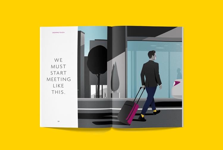
The studio also commissioned copywriter Nick Asbury to create new marketing slogans to be used across advertising, which aims to “inject a little bit of personality” into the brand, says Jamie Breach, senior designer at NB Studio. Copy is set in Agenda typeface.
The new visual identity accompanies an interiors overhaul for the hotel brand worldwide, completed by design consultancy PearsonLloyd. This aims to help it appeal to a younger audience, and break away from the “generic, bland world” of corporate hotel design and its “sea of sameness”, says Alan Dye, creative director at NB Studio.

The whole new look for the hotel chain aims to appear “friendlier” and takes inspiration from the style more modern short-term rental companies like Airbnb, adds Dye, and reflect how “younger people are now going on business trips more.”
Crowne Plaza decided not to change its logo because of the cost of replacing all the exterior signage worldwide, following a recent overhaul of these signs, says Dye.
The new look is currently rolling out in Crowne Plaza hotels worldwide, across interiors, wayfinding and signage, online, print and marketing materials and merchandise. A marketing campaign has been created by advertising agency Ogilvy’s New York office.


Read this next

-
Post a comment


