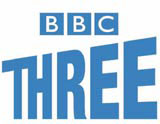
Unintelligent branding … get the Helvetica out of it

‘Sometimes it looks as if designers like nothing better than to slag off each other’s work,’ opines Richard Clayton (News Analysis, DW 15 May). I would agree with every word. Except the ‘sometimes’.
However, regarding concerns about the current quality of corporate identity work, criticism is most definitely justified. Is it any coincidence this year’s D&AD Awards judges felt unable to make any nominations in the corporate and brand identity categories?
There is now a new one-stopshop movement afoot. The current ascendancy of the HelveticaRanged-Left Brigade has seen that style mooted as the solution, regardless of your requirement, positioning or market.
A whole range of recent high-profile branding initiatives have been disappointing in the extreme. Think of the likes of the BBC Three and Channel 5 identities.
Little intelligence is being demonstrated here. The trend for over-reliance of simple colours and unassuming typefaces does little to capture the essence of brands. It seems to have been forgotten that most consumers’ first contact with the brand will be via the logo.
Whatever happened to such striking work as The Partners’ rebrand of Wedgwood? It was elegant and simple, and effectively redeployed elements of the brand’s earlier marque. It was done only a few years back, but it suddenly seems much longer ago.
Ady Bibby
Creative director
True North
Manchester
M4 5DL
-
Post a comment


