Fair and square opinion of a totally pixelated idea
US conglomerate Philip Morris’ proposed new name and logo is a case of déjà vu, but at least this time the fabricated moniker has some truth about it.
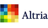
US conglomerate Philip Morris’ proposed new name and logo is a case of déjà vu, but at least this time the fabricated moniker has some truth about it.
The identity, by Landor Associates New York is similar to the Liverpool Biennial logo.
Altria, according to Philip Morris, derives from the Latin ‘altus’: which loosely means, to ‘reach higher’. And the coloured squares of the identity depict Philip Morris’ various brands, from cheese to chocolate.
We presume the dark square depicts the tarnished lungs of its cigarette arm’s target audience.
Start the discussionStart the discussion
-
Post a comment


