
Gail Bichler on how to design a magazine like it’s “the last one on earth”
Speaking at Offset Dublin, the design director of the New York Times Magazine talked about the merits of putting time and effort into print, why superimposing images in Photoshop is inauthentic, and how designers and journalists can embrace new technology.
The New York Times Magazine is known for its investigative and in-depth journalism – but the design of the publication is as thoroughly thought-out as the content within it.
The magazine, founded over 120 years ago, is the weekly, Sunday magazine supplement of the daily newspaper, with an accompanying online edition.
While it holds some of the gravitas of its parent publication, having previously investigated topics such as workplace sexual harassment, US political party tensions and the refugee crisis, it also has more editorial and design freedom, exploring an array of subjects and formats.

The magazine has been known to delve into more daring realms. This has included a 40,000-word story – essentially a short book – on the Arab Spring, a feature on online pornography featuring a racey magazine cover, and an entire issue flipped sideways to demonstrate the height of New York’s tallest buildings.
It has also used new technology to make journalism more immersive and engaging, bringing issues such as the refugee crisis to life for readers by using virtual reality and 360-degree video to document the lives of displaced people in Lebanon, South Sudan and Ukraine.
The magazine places a huge impetus on its print and online design, and appearing visually and editorially different and interesting. A core team of nine people, headed up by design director Gail Bichler, is behind its design.
Speaking at this year’s Offset Dublin, Bichler ran through the team’s design processes, and showcased covers from the last 10 years which demonstrate how experimental the magazine can be.
Bichler’s dream was never to be an editorial designer – having originally trained as a fine artist, she says she saw herself becoming a painter or printmaker and “came to graphic design later”, learning about it on the job. She first joined the magazine as a freelance designer in 2004, and eventually worked her way up to design director.
Over the last 14 years, Bichler has overseen the redesign of the magazine, which was led by herself and art director Matt Willey in 2015, has tackled some controversial topics and created some courageous covers.
“One of the pleasures of working at the magazine is the variety of subjects we cover,” she says. “We get to comment on events happening in the world in real time.”

The way the design team works is much in line with how a journalist on the magazine might – to tight deadlines and a written brief.
The team receives written stories in manuscript form, and are given anywhere between two days and two weeks to come up with conceptual covers. Sometimes, rather than a fully-written story, they are just given a 50-word summary and come up with concepts based on that. According to Bichler, the more words the better, in terms of helping to spark ideas.
“I read through it, underline things and sketch in the margins,” says Bichler. “That’s the ideal way for me to work.”

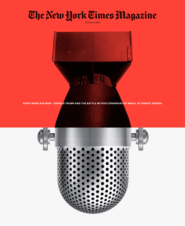
The “variety” of subjects stretches from pop culture through to politics. One issue featured an interview with musician Lorde, and saw a magazine cover of a black-and-white photograph of the singer accompanied by dishevelled, colourful dots, obscuring much of the masthead – a literal, graphic interpretation of how Lorde has synesthesia, a medical condition that means someone sees colour when they hear music.
Covering up key elements of the brand’s identity is not an issue for the New York Times Magazine, nor is publishing controversial material. One issue focused on pornography, and saw a racy image of two people grace the cover. While they were not permitted to “explicitly show a specific sex act”, the cover showed blurred, suggestive and alluring snapshots of people’s faces and bodies.

“We are not a news-stand magazine,” says Bichler. “We have a lot of freedom, and can do things that those magazines can’t – like cover up our logo or publish cover stories on a controversial or really hard topic.”
The designers look to create powerful design through different mediums and techniques. Some features require a documentary-style or photographic image, while others “need to communicate an idea graphically”, Bichler says. “These ones are the hardest to make but I love working on them the most,” she adds. Visualising Lorde’s synthesesia through vibrant, coloured dots is one example of this.
Other covers have required the team to make three-dimensional objects with their hands before transferring these ideas to two-dimensional images on a page.

Examples include “knitted” typography created in collaboration with Jessica Walsh for an issue based around the 2017 women’s marches and feminist movement, and a set of balloons with Donald Trump’s face on that were designed, inflated and deflated, and photographed at these different stages to symbolise the “hot air” and turbulence of his presidential campaign.
The magazine’s designers love symbolism, and conveying deeper messages through tangible imagery and photography is a trend that runs throughout the New York Times Magazine’s covers.
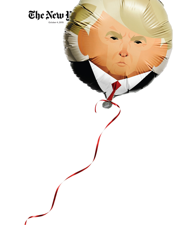
“We try to make objects as often as possible,” Bichler says. “Photographing a real object has an authenticity to it that we can feel – and it’s also fun.”
Sometimes, the team go completely off-piste and create a special themed issue, which gives them far more creative freedom to temporarily transform the magazine into something new.
What Bichler describes as “the most extensive redesign” the magazine has seen in the last 14 years, was for an issue dedicated to the viewpoints of New York’s tallest buildings. The issue – called High Life: The City Above 800 Feet – was flipped 90-degrees so that the whole thing read vertically, cover-to-cover, including all features and advertising, with new typefaces drawn and headlines written to fit this new size.

“We make 52 issues of the magazine per year, and we felt this was a risk worth taking,” says Bichler. “We’re not a magazine for designers – we’re a magazine for everyone. We only do these things when it adds to the content or experience.”
The magazine’s design team has used all sorts of media to create a more unique experience for the viewer. Another special themed music issue, intended for online viewing, featured various musicians, and as readers scrolled down the page, they unlocked music by each superstar and accompanying backdrops.
When dealing with more sombre or hard-hitting issues, the magazine has used emerging tech to enhance its journalism and provide readers with deeper insight into world issues.

A VR and 360-degree video online platform called The Displaced launched in 2015 and followed the lives of three children in Lebanon, South Sudan and eastern Ukraine, who have experienced war and been displaced from their homes.
Alongside the launch of this series, the New York Times Magazine sent out free cardboard, VR headsets with its printed newspaper – ironically, Bichler says, using the archaic format of print and the newspaper’s “legacy” to give more people access to a new and exciting form of storytelling.
“The magazine has become a place for innovation within the New York Times recently,” she says. “Being a small, nimbler group within the company, we have more flexibility and more room to experiment.”
She adds that journalists and designers working for newspapers should take advantage of new tech like VR, as it provides a real-ness and closeness that cannot be replicated with two-dimensional mediums.
“VR is a really powerful format for storytelling in terms of generating empathy,” she says. “When you’re watching a film, you have a certain distance. With VR, it feels like you’re there – standing in a swamp, or in the rubble, looking up at the sky through a hole in the ceiling.”
At the same time, the magazine does not want to neglect its print edition – contrastingly, it wants to keep it alive with interesting, unique formats, turning printed issues into keep-sakes.
Flipping an issue vertically was one wacky solution, and another was laying out an issue like a book rather than a magazine.
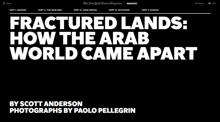
In 2016, the magazine devoted an entire issue to one 40,000-word, investigative story on the Arab Spring. The designers took away the defining elements of a magazine, such as drop caps and pull quotes, and instead gave it a wrap-around cover and lay it out like a novel. This was sent out to subscribers as a memento, giving the weekly magazine a longer life.
The team also prides itself on putting time and effort into creating powerful covers, again in a bid to pay respect to the printed page and give the magazine a sense of longevity.

One issue included a feature on immigration in New York, and looked to show how immigrants often go unnoticed in the city. The team hired French artist JR to create a huge, large-scale installation on Flatiron plaza in Manhattan. The installation – which was a huge photograph of an immigrant who had recently moved to New York, made up of 62 strips of paper – took 40 people to install over 24 hours. It was then photographed from a helicopter, showing pedestrians walking all over it, oblivious – a symbol of the “invisible” immigrant.
The efforts of the magazine are not always recognised, Bichler says, and attempts like this are often greeted by exasperated social media users asking why the team did not use quicker and easier means, such as Photoshop, to erect such images.
But shortcuts go against the New York Times Magazine’s mantra – to celebrate and give value to the printed word through clever, thought-out imagery, while also embracing new ways of investigating and telling people’s stories.
“We treat every issue as if it’s the last magazine on earth,” says Bichler. “I love that to describe what we do.”
Offset Dublin took place 23-25 March 2018 at the Bord Gáis Energy Theatre, Grand Canal Square, Docklands, Dublin, Ireland. Head here for our coverage on the festival, and here for more info.


Gail Bichler continues to lead the way in the weekly magazine’s newspaper colour supplement. The design, art direction, wonderful spreads, intelligent, idea-driven covers and great writing. ‘The New York Times Magazine’ is consistently brilliant. And keeping up this kind of standard on a weekly turnaround takes passion and tenacity.
Genius work. A tireless strive for excellence and with those results, I assume highly rewarding. If only everyone had this much passion and energy for their work.