NatWest goes back to its roots with new branding
Consultancy FutureBrand has designed the colourful new branding for NatWest, which is based on the original logo mark created in 1968.
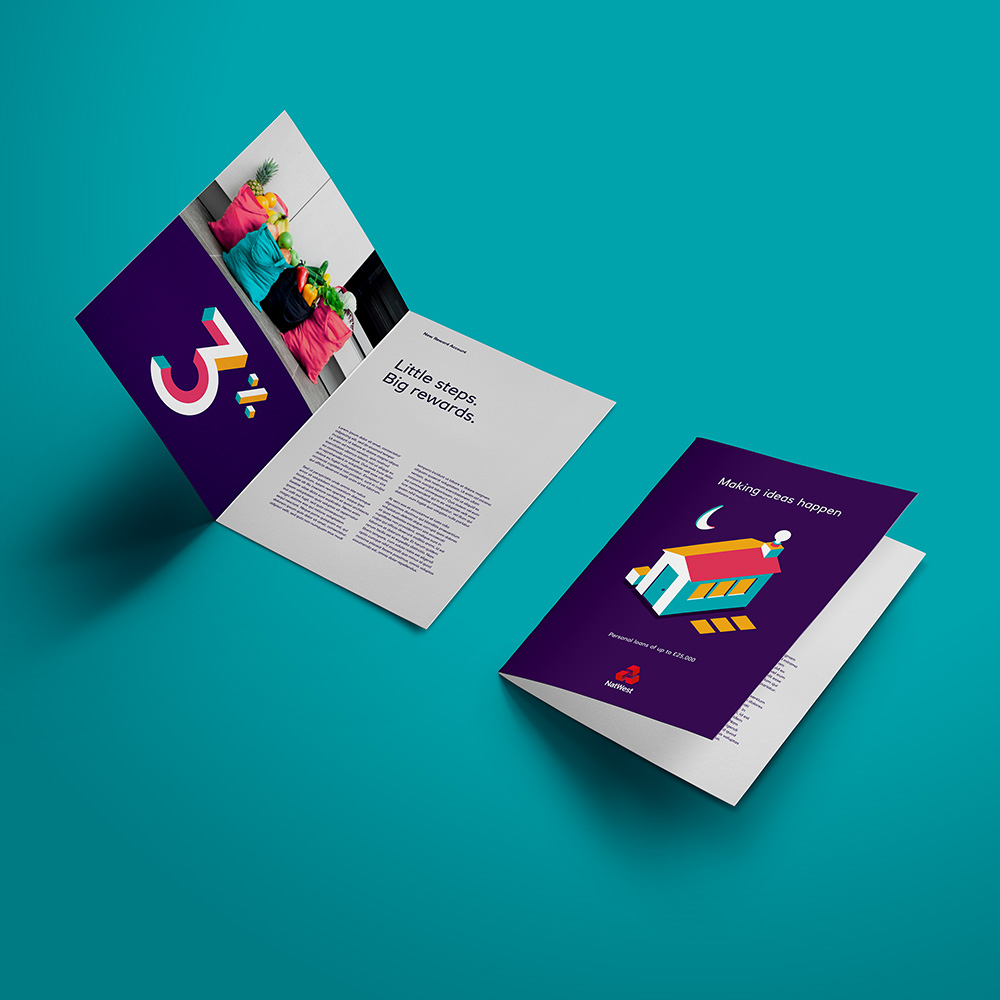
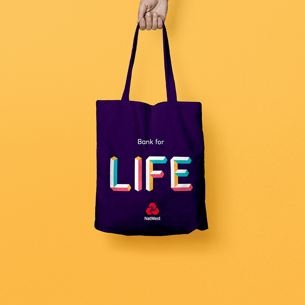
NatWest has undergone a rebrand, with a new three-dimensional, animated logo and colourful graphics to make it “stand out from its competitors”.
Design consultancy FutureBrand has created the new branding, which sees NatWest’s triangular icon, made up of three chevrons, turned into a three-dimensional shape composed of three cubes.
NatWest is owned by parent company RBS Group, which also owns the Royal Bank of Scotland.
The new icon has been inspired by the bank’s original brand guidelines when it was first formed as National Westminster Bank Limited in 1968, says FutureBrand.
The logo had three interlocking cubes which symbolised “three separate banks coming together under the brand” – originally National Provincial Bank, Westminster Bank and District Bank.
“We used this as a jumping-off point, using the cubes as a storytelling device to create illustrations and build stories,” says Dan Witchell, executive creative director at FutureBrand. “It was a gentle evolution of the brand rather than a reinvention.”

Other new visual elements including a series of colourful graphic illustrations and three-dimensional colourful typography for body copy have been implemented, using a bright colour palette of blue, purple, pink, yellow and white.
A series of moving gifs and animations have also been incorporated into the branding, which “the illustration style lends itself nicely to,” says Witchell.
The logotype, which has not changed, is a bespoke typeface called RN House Sans, which is used across all three elements of the current RBS brand – the parent group, Royal Bank of Scotland and NatWest.

The consultancy’s goal was to create a banking brand which stood out on the high-street, Witchell says. “If you look at most of the competitors in the banking sector, they use a full bleed, nice crafted photography and a white sans-serif typography – they’re all quite similar. We wanted to create a brand that was different and which stood out.”
While the new look intends to attract all audiences, Witchell says that the colourful, animated elements lend themselves to a younger audience.
“We all know that you need to attract younger people into banking,” says Witchell. “We want to introduce them to the extra protection they can get from a bank, compared to some of the other digital, banking alternatives.”

The rebrand is part of FutureBrand’s wider redesign for the RBS Group, which also saw it refresh the look of Royal Bank of Scotland’s posters and advertising material with colourful, bespoke twill-based patterns for backgrounds. This aimed to reference the bank’s presence in Scotland while avoiding the “clichés of tartan”, says Witchell.
NatWest’s new branding is currently rolling out on marketing materials, posters, merchandise, in-branch animations and online. It will begin rolling out on store-fronts later, says FutureBrand.


Read this next


It seems odd to rework the original version given that the rationale for it then no longer apply to where the bank is now.
Was this a case of jumping on the ‘Homage Bandwagon’ or just because they wanted to use cubes as part of the rebrand?
https://www.cgd.pt/Pages/default_v2.aspx
Very similar to Portuguese National Bank.
Isn’t about time that design realised, or owned up to, the fact that a spurious ‘bespoke’ typeface and fiddling about with an historical logo design should be about more than gaining a bag full of lucre. And where are the critics on the sidelines who should be shouting about “the Emperor’s new clothes”? Hey, but what do I know as an ancient almost-retired designer in the sticks.
Fiddling while rome burns — work that’s so lightly surface mounted I can see it slipping off already.