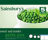
Brewer Riddiford’s design to compete with DoH logo

Sainsbury’s is launching its own five-a-day logo to rival that unveiled last week by the Department of Health, as supermarkets seek to broaden the marque’s application.
The Sainsbury’s version, which is designed by Brewer Riddiford, will be applied to the supermarket’s own-label ranges of fresh, frozen, canned, dried or juiced fruit and vegetable products and will start to appear in-store from the end of May.
The criteria for the marques is different. ‘At this stage the Government logo will only be applied to food with no added salt or sugar,’ a DoH spokeswoman says.
But the Sainsbury’s logo will be used across own-brand products such as ready-meals with a limited fat, salt and sugar content as well as fresh food, according to a company spokeswoman.
She says the retailer is creating its own marque because it wanted to widen the criteria to include healthy-eating ready meals and because the Government marque only includes England, and the supermarket chain is nationwide.
‘Food standard marques help reassure customers about the quality of the produce they’re buying,’ she says. A Tesco spokesman agrees. The supermarket has been using its own ‘five-a-day’ marque for two years. ‘It has been a huge success. People appreciate the guidance,’ he says.
The DoH insists that its campaign will not be downgraded by rival marques because it is undertaking educational programmes as well as labelling food.
‘Supermarkets [with their own five-a-day logo] may well be stocking food with our logo already on it. [But] our campaign is backed by messages from health professionals which we’re keen to get out. We wanted to create a logo people can trust. Around 50 organisations in the food industry have already signed up,’ the spokeswoman explains.
The logo, designed by Identica, was developed with the help of ‘stakeholders’ such as doctors, nutritionists and supermarkets, some of which, like Tesco, had existing five-a-day marques, says Identica account director Jessica Hue Williams. The group has also created a separate portion indicator icon to run alongside the main logo, which will be used on point-of-sale and promotional literature.
Hue Williams denies that the rival programmes offer potential for confusion among consumers. She says feedback showed people wanted better guidance on what constitutes a fruit or vegetable portion and were not using existing marques.
‘We were aware of other identities. There was no confusion about the marques; our research showed that consumers weren’t particularly aware of logos being used by supermarkets such as Tesco,’ she says.
The five-a-day logo is the latest in a long line of food standard marques on show in supermarkets. Among them are the British Farm Standard’s red tractor logo, designed in 2000 by now defunct Basten Greenhill Andrews, which identifies home-grown food to help it compete against imports; the Soil Association logo, used widely on organic food; and the Fairtrade marque, which appears on produce monitored at source to ensure farmers are paid fairly for their food.
Food standard marques have to add value to a product and be clear about what they stand for, or they can muddy the water, says Fairtrade deputy director Ian Bretman. ‘We are concerned [about the proliferation of marques in supermarkets] and have to justify what Fairtrade represents. General, all-purpose ethical labels, of the sort around in the late 1980s, can just become a marketing tool,’ he says.
-
Post a comment


