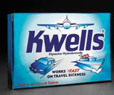
Design Bridge remedy for Kwells

Roche Consumer Health’s travel sickness brand Kwells goes into pharmacies this week with revamped packaging by Design Bridge, as the company updates the product’s image ahead of a market share tussle in the sector.
With their origins in the 1950s, Kwells’ illustrative graphics distinctively convey the ‘joy of travel’, says Nick Verebelyi, Design Bridge board director 3D branding and packaging. ‘The brand’s particular style of drawing has a light-hearted quality. The challenge was to update this equity while giving it a more serious edge.’
Blue, white and metallic silver colours suggest medical reassurance and a calming effect. The Kwells logo is unchanged, but the ‘fast’ badge has been redesigned to give the brand greater impact as a rapid remedy.
‘As a product that will appear behind the pharmacist’s shoulder, it has to be an eye-catching design for consumers to request it,’ says Roche Products brand manager Estelle Coughlan.
Design Bridge won the brief last summer without a pitch, having worked on four previous projects for the client. Senior designer Ray Smith is responsible for the design.
-
Post a comment


