Knox identity treatment for Imperial Cancer Fund
The Imperial Cancer Research Fund is re-branding its charity shops to improve its high street presence in the increasingly competitive charities sector. It is aiming to attract a broader cross section of consumers and raise its local profile.
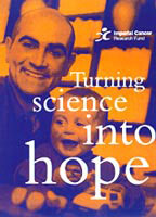
Designed by Leicester-based consultancy Knox Associates, the overhaul includes a new colour scheme in bright blue and orange under the strapline “Turning science into hope”.
Knox has created contemporary interiors using wood-effect flooring and introduced giant graphics of words such as hope and progress. Local information points and noticeboards have been introduced to encourage community involvement.
In gaining greater high street recognition and public awareness, the charity hopes to generate increased funds for research. The new design will roll out across 75 of Imperial Cancer’s nationwide chain of 450 shops from October, following pilot schemes in Chiswick, Stratford-on-Avon and Headington near Oxford.
Andy Heath, central operation director, Imperial Cancer Research, says: “We are tearing our store design apart to achieve a smarter finish and reach another level of charity retail design. High street charity shops are the mouthpieces of our organisations, as well as being the focal point of the local community.”
Berryman Ball recently designed a new identity for charity Sue Ryder, following research that showed people did not know what the charity collects money for. Oxfam launched a new identity and refurbished several shops, with design by Interbrand Newell and Sorrell and Conran Design Group respectively.
Read this next

-
Post a comment


