Digging a shallow grave
British designers say design should convey a message. But if the Dome is the best they can do, can they expect people to pay attention?
For years we have been collectively tugging at the coat-tails of Business and the Populace, trying to get attention for how clever we in the design industry are. We come out with statements like: “Design isn’t just about graphics or interiors or products, it should sit at the very heart of an organisation”, or “Design isn’t just the look of something, it’s about the entire message”. We’ve been making more claims than a petty insurance fraudster.
When we’re not proclaiming our abilities we’re sulking, moaning that clients restrict our creativity, complaining that British Design & Art Direction is biased in favour of advertising and whining that the media and the public don’t understand the value of what we do.
That’s why what’s inside the Millennium Dome is so important to the entire design industry. The creation of the Dome zones is by far the greatest single opportunity modern design has had to prove its worth.
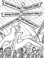
So, these zones are supposed to represent the best that British design can do. Do they? Absolutely not. In fact, I have never experienced such an appalling melange of glitz, propaganda, confusion, stupidity and arrogance. Let me offer a selection of edited lowlights:
The Mind zone managed the remarkable feat of making me feel disturbed, confused and bored at the same time. The “intelligent” robots didn’t work, the captions on the wall were inane and all of that is overshadowed by a giant model of a boy whose facial expression and defensive crouch are classic indicators of sexual abuse. The model is literally and metaphorically an enormous creative miscalculation and should be removed immediately.
The Faith zone sets out to demonstrate the huge range of belief in the UK, but simply sticks banalities about various religions and groups up on a display stand and throws soporific sound clips at you from walls awash with hopeless drivel. The silence and subtlety of the temple is a welcome respite.
Talk (sponsored by BT) and Journey (sponsored by Ford) are nothing more than walk-in commercials, awash with pretension and brand plugs for the sponsors. The first stage of Talk locks you in a dark room and bombards you with a patronising “film” about how important talking is to human beings. You don’t say. Not an ounce of real imagination or sensitivity has been expended to help the visitor develop and retain new thinking. Move upstairs and you can have your photograph taken with BT’s current advertising icon, ET. This zone isn’t a conversation between visitor and curator, it’s a sales pitch.
Journey is a lighter sell, but no less disheartening. At some point during my miserable, processional trudge past the array of ponderously displayed transportation objects I suffered death by caption. I concluded that the walk through this zone was probably the least enlightening journey I have ever made.
I can barely bring myself to comment on Money, except to say that, despite the million quid in notes on display, it is an utterly worthless experience, involving coal-powered ex-Space Invaders consoles.
The thing is, all the zones look very nice when you first encounter them. They promise and entice and lure. But when you get inside they have absolutely nothing to say. Clarity of message has been sacrificed in favour of a wash of generality and truisms. Information is thrown at you from all directions in the desperate hope that some broad sense of a big idea might stick.
Clearly, communicating with an audience as broad as the entire nation is a tough brief, and one that has defeated those responsible for these zones.
It’s as if the designers were afraid to engage with the visitor’s brain and settled for flirting with their eyes and shouting in their ears instead.
The zones I mention are a shameful waste of an opportunity. Where is design’s ability to take a wodge of content and turn it into a compelling, involving, learning and fun experience? Where is the design intelligence we hear so much about?
Those who argue that matters of content are the client’s responsibility, not the designer’s, are out of date. If design is to be taken seriously it must take responsibility for content and meaning and effectiveness, not just tart it up.
Have we created the greatest show on earth? No, all we’ve created is a stupendously damaging illustration of design’s tendency to lapse into superficiality and visual titillation at the expense of real meaning and worthwhile human interaction. The next phase in the Dome’s life may give us an opportunity to do it better, but – on the current evidence – why would the victors in the race to fill the Dome for a second time turn to British designers?
Read this next

-
Post a comment


