The Team illuminates the Big Lottery fund
The Team has created the brand identity for the Big Lottery Fund, a fledgling National Lottery distributor formed from the merger of the New Opportunities Fund and the Community Fund.
The organisation, which launches this week, becomes the largest of the UK’s 14 distributors. It will allocate half of the National Lottery money to good causes, health, education and environment projects, plus charity and community activities.
The Team account director and group client partner Peter Mills says the challenge was to come up with an identity that would ‘reconnect’ with the public.
‘Although the New Opportunities Fund and the Community Fund were well known among their stakeholders, they were virtually unknown by the public,’ he says, adding that the two distributors also suffered from a perception that the Government exercised too much control over how they earmarked funds.
Mills claims the Big Lottery Fund brand has a ‘high street feel’, while the Team’s visual identity aims to get across ‘the idea that it is a friendly, people-based organisation’.
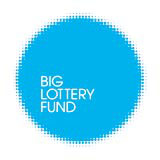
A fuzzy-edged circle ‘spotlight’ logo is rendered in bright pink, blue or purple. Brand language emphasises illumination and the organisation’s willingness to fund projects irrespective of size.
Applications include literature, for which The Team has created digital templates, stationery, signage, staff brand books and a Redhouse Lane-designed website, www.biglotteryfund.org.uk.
The Team collaborated with Brand Guidelines on the development of Big Lottery Fund’s brand platform and Secretary of State for Culture, Media and Sport Tessa Jowell selected the organisation’s name.
Read this next

-
Post a comment


