Lower the tone
Packaging is changing as the Government demands junk food companies stop brazenly targeting children with colourful designs, explains David Benady
The Food Standards Agency is calling for snack food packs to feature more health information about the products. The health White Paper recommends the trial of a traffic light system, with a red light indicating fatty, salty or sugary foods, to be eaten sparingly. Amber would mean fatty but nutritious food, to be eaten in moderation. Green is for fruit and vegetables, to be eaten often. A traffic light system has been introduced by the Co-op and Tesco is testing out its own version, designed by Rocket.
Andy Knowles, a partner at design consultancy Jones Knowles Ritchie, says: ‘Packaging has to give confidence to parents in the light of the current issues. What may change is stuff that single-mindedly attracts kids.’
He thinks brands such as the Walls Calippo ice lolly range, Rowntree’s Fruit Gums and Pastilles and Smarties are all brands overtly aimed at children, so may need to tone down their packaging. Fruit Gums and Smarties are produced by Nestlé, which designs most of its packaging using an in-house team. The media furore around the new hexagonal Smarties pack announced last month, designed in-house and due to hit the shelves in the summer, shows exactly how emotive the packaging can be.
Nestlé also recently announced that it will overhaul its food packaging in the UK ‘to help guide consumers in their understanding of nutritional content’. This will include featuring calories per serving on the front of packs, while on the side or back, there will be ‘guideline daily amounts’ listing calories and fat per serving.
Knowles thinks the most important factor for designers is that they create packaging that inspires confidence among parents. He says of his own group’s redesign of Penguin biscuits, ‘We wanted to make it clearly identifiable as a Penguin. You have to give it a feel so it doesn’t look artificial or cheap so mothers can be confident about it.’
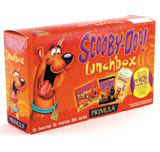
One way to target both parent and child is through multipacks. Bruce Duckworth, creative director of Turner Duckworth, says the packs are bought by mothers for their children, so the outer packaging can include ingredient and health information. Once opened, the secondary packaging can be aimed at children.
But he does not believe there is an ethical imperative to package snack foods in a less attractive way. ‘I don’t think there is a problem with having indulgent brands. It is the duty of other brands to become more alluring – we should package carrots better,’ he explains.
Duckworth says it would be wrong for pack designers to misinterpret the nature of a product to make it look more healthy. ‘Trying to change an artificial product into a healthy looking one like Sunny Delight is pointless. Packaging has to be true to the brand,’ he says.
Sunny Delight was originally merchandised by Procter & Gamble in chiller cabinets, giving the impression it was a healthy, natural drink like orange juice. Sales soared initially, but when it emerged that it contained little real fruit, sales fell and P&G eventually sold it off.
Pack design will play a crucial role in the marketing of snack foods, especially when TV advertising and other forms of marketing are curtailed. Design will then carry the brunt of providing solutions to a growing health crisis, and be subjected to the same intense scrutiny.
David Benady is a contributing editor at Marketing Week
-
Post a comment


