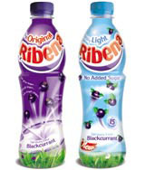
Seachange redesigns Ribena range

GlaxoSmithKline is relaunching Ribena with a reworked identity and brand proposition, designed by Seachange Creative.
The move comes as Ribena gears up to roll out Ribena Really Light, to replace Ribena’s axed Toothkind and Light sub-brands.
The identity, featuring a redrawn marque, pack graphics and packaging, will launch in April across all products.
The aim is to update the brand and add a new, playful tone of voice, says Sally Costen, creative director at Seachange.
The logo is underlined with a broad smile and images of blackcurrants are set against a backdrop to evoke ‘sunny summer days of childhood’. The on-pack graphics are quirky and light-hearted, and the bottle shape is more fun and engaging.
According to Costen, ‘We have created a strong identity with great shelf impact, which has the versatility to accommodate sub-brands and will work effectively for future new product development initiatives.’
The launch will be supported by a £10m integrated media campaign. Seacreative was appointed as Ribena’s lead design group in 2001, following a three-way pitch.
-
Post a comment


