The full treatment
Suzel Pitty finds out how pharmaceutical packaging is changing to meet the demands of consumers
Your journey into work this morning is broken by a crashing headache, so you stop to buy your favoured brand of medicinal relief. But the pharmacy offers a bigger headache, as you struggle to decipher your brand’s “face” among the sea of similarly packaged competitors.
Pharmaceutical packaging design is both a complex and crowded market – complex because all medicines, particularly those issued by prescription, adhere to strict regulations on how they can and cannot be packaged, and crowded because over the counter and general sales line medicines have increased in numbers and the battle for shelf-shout.
Increasingly the design response assumes consumers want a greater say in the medicines they take. As Lewis Moberly’s strategic development director Hilary Boyes explains, “It’s part of the social and information trend, where consumers are much better informed.”
Back on the shelves, Glaxo SmithKline’s Solpadeine is an analgesic brand that typifies a shift in the design industry’s response. Its former identity was characterised by a red background and yellow jagged line, an all too obvious symbol for pain. As design group BrownKSDP discovered in its pre-design research, the consumer opinion was that the brand was “brash, aggressive and 1980s”. Its new packaging favours a warmer image and softens the brand’s signatory red.
Tutssels Enterprise IG director Beverley Law sees this as the natural response from the designer. “Language has become more emotional, with the need to talk to consumers on a lifestyle, feel-good level, as much as a relief level – it’s their personal illness,” she says. Tutssels Enterprise IG works with Glaxo SmithKline on a number of products, from packaging for Zovirax cold sore cream, to products that cross over from prescription to over-the-counter, such as Zantac anti-ulcer treatment.
It is not an isolated response. The redesigned packaging that Design Bridge Structure created for two women’s health medicines – Feminax and Cystopurin, produced by Roche Consumer Health, promises the restoration of well-being and the elimination of pain.
There are a number of reasons why the consumer climate has changed. The Internet communicates on a direct level and provides a wealth of diagnostic expertise. And less time available to spend with a doctor means that self-enquiry is becoming more common. As Boyes confirms: “If a patient asks a doctor for a product and it’s right for the condition, why would the doctor start a discussion?”
These factors are just as relevant when the branding has a global application. Brandhouse WTS managing partner Mark Gandy verifies that “it requires a different approach as a design consultancy because some markets are completely different”. Brandhouse WTS created the brand for Glaxo SmithKline’s coldsore cream Vectavir, using a more uplifting graphic to de-stigmatise the image of herpes.
Lewis Moberly’s work for Nicotinell cigarette replacement patches for Novartis required pan-European branding, where little consumer recognition existed between similarly named brands. As Boyes says, “The creation of a distinctive pneumatic icon was a critical part of Lewis Moberly’s brief.”
Each country has its own regulations on what is permissible and these have varying degrees of stringency compared to the UK. Here, the Medicines Control Agency, as part of the Department of Health, is responsible for safeguarding public health by ensuring that all medicines meet acceptable safety standards. It also provides guidelines which the industry must comply with.
The MCA is ever vigilant and, despite a decline over the past five years in the number of reported accident-and-emergency accidents as a result of medicine tampering, it recently launched an initiative to assist in reducing this risk further from error in packaging. The Committee on Safety of Medicines has set up an expert working group to advise the industry and will report its findings to ministers in July.
While the guidelines remain clear in the UK, exposure to global markets may highlight alternative practices, such as how prescription medicines can be advertised to consumers in the US.
Law reflects on this prospect in the UK, “If it happens, it will mean an increasing need for prescription-only drugs to have strong brand and visual identities and ultimately identifiable and meaningful packaging, which can be advertised to consumers.”
“The problem is when design is not a great reflection on doctors,” counters Ergo director Simon John. “They have a pre-eminent position, they are highly knowledgeable and anything that devalues their expertise, or has pretty pictures on it, makes it look like toy-town medicine.”
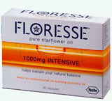
Ergo’s designs for Roche Consumer Health’s Floresse hormonal balance product, containing starflower oil, uses the symbol of a spirit level to evoke benefit, rather than reverting to flowery images. “The balance to strike is one where the person who is prescribing feels good about the prescription and the consumer who is taking it feels as if they are not just being given a white box with the most fearful description written across it,” says John.
Law sees a balance. “There are restrictions, even in the OTC arena, and you have to abide by these legal practices. But what design has started to do is work much harder within those restrictions and, while not bending them, it has realised that there is scope to start to talk to consumers in a more fmcg way and still abide by the regulatory bodies,” he says.
The basic structures adopted in pharmaceutical packaging are common and the requisite security measures, such as child-resistant closures, have been in place since 1978. That can be limiting, as Design Bridge Structure managing director Nick Verebelyi has found. “It’s a great frustration for a structural designer, as there are huge practical issues that could be elegantly met through packaging design. The industry is still in the mindset of having pills in blisters and blisters in cartons,” he says.
A potential for greater creative packaging design may lie with generic and own-brand medicines. “Increasingly, brands are losing their patents, so the active ingredients that make them work can be taken by anybody,” confirms Law. “There’s a huge growth of generic products on the market that do the same as some of the leading brands, so getting your message through is harder.” Supermarkets form the biggest arena for these, with their aggressive pricing and promotional tactics. They are well positioned to hear the consumer’s needs.
The Co-op’s in-house design team has introduced Braille to all its own-label medicine packaging. It recognises the needs of more than one million blind and partially sighted people in the UK, which is no small audience and makes good economic sense. It is telling that this innovation has been introduced – at no extra cost to the consumer – on an own-brand and the Co-op is hopeful that others will follow its example.
Once the external packaging is tackled more effectively, attention could turn to the design of the inside, the actual medicine itself. Coley Porter Bell creative director Martin Grimer is hopeful. “The problem is you look at this tablet and it looks generic, it’s a white, round pill. A missed opportunity is not doing an ownable shape or an ownable dispense in the way you actually take it. What a great vehicle for branding,” he says.
Regulations
-
Post a comment


