
Hair brand Fable & Mane’s identity is inspired by its Indian roots
Manchester-based design studio Alphabet was inspired by storytelling as well as Indian shopfronts and signage for the beauty brand.
Design studio Alphabet has created the identity for hair wellness brand Fable & Mane, inspired by the company’s Indian roots.
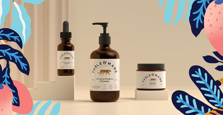
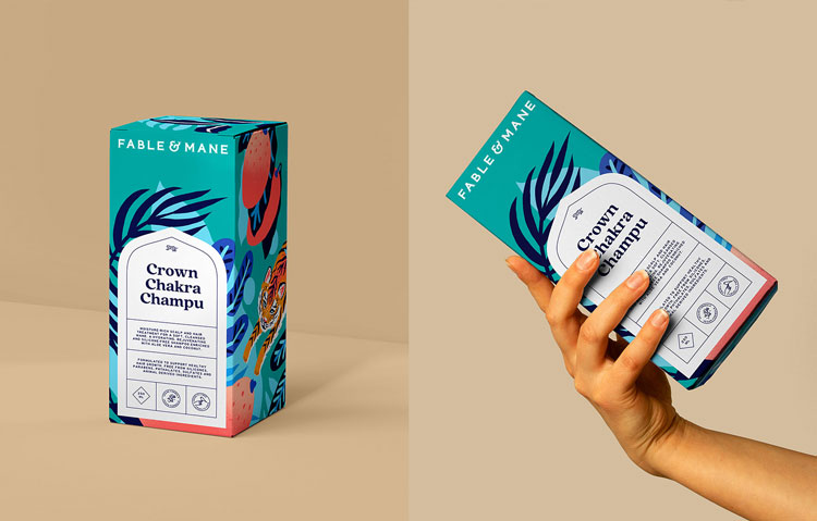
Alphabet has crafted an illustrative tiger logo, bespoke typeface, as well as labels and packaging for the beauty brand.
Fable & Mane was co-founded by siblings Nikita and Akash Mehta. According to the company, Nikita was reminded of the Indian tradition of hair oiling at a time of stress.
Inspired by how her grandmother would massage her head with homemade blends of plant oils, she founded her own range of hair products, which range from hair masks to shampoos and conditioners.
Alphabet co-founder Sam Lane says that Fable & Mane’s Indian heritage influenced the identity, which aims to tie into an “East meets West” visual. “[The founder] wanted to take this concept and turn it into something more commercial which suits a Western audience,” Lane adds.
The visuals also aim to incorporate a storytelling elements, such as those found in storybooks, as a nod to the brand’s name, Lane explains.
The central part of the identity is the tiger logo, chosen for the animal’s symbolism in Indian culture. According to the studio, the tiger represents magnificence, power, beauty and is the vehicle for the goddess Durga.
The studio worked with Marcos Navarro on the illustrations for the project, which are used on campaign material as well as on product packaging.

The supporting colour palette of was inspired by the tiger – pinks and oranges from the animal’s ears and face as well as blues from its eyes.
These colours are also a nod to the colourful shopfronts and signwriting in India, according to the designer. These are incorporated into the illustrations as well as a series of stickers which can be used for digital and physical applications.

Alphabet designed a bespoke typeface for the wordmark, which was again inspired by Indian signwriting. “We looked to typography that’s used in India, and we found one that was similar to this, but it was hand-rendered and quite rough,” Lane adds.
The team created a neater version, and looked to the shape of snake tongues and tiger tails for the letters’ terminals. This adds a more ornamental touch to the brand identity, Lane explains.
The shapes for the label are a modern take on Indian beauty packaging as well as the country’s architectural details, Lane explains. The label features a rounded window shape, which aims to bring “an Eastern touch to Western design”, he adds.
While the containers have a more pared-back look – in keeping with brands like Aesop – the team went “more wild” for the box packaging, the designer says. These feature a wraparound illustration of the tiger which seeks to be “more eye-catching for in-store purposes”, Lane adds.
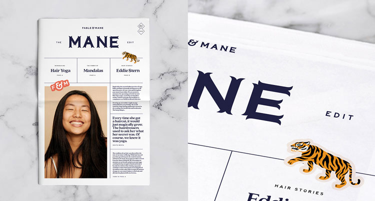
Alphabet also created a bi-monthly digital newsletter called ‘The Mane Edit’. This includes content about yoga and meditation, as well as details about the company’s charitable endeavours.
What do you think of the identity? Let us know in the comments below.


Love it! Beautiful work 🙂