Pack an archetypal packaging punch
How do we harness the influence of archetype theory as a marketing tool and turn it into design advantage? asks Dorothy Mackenzie

Jester, Innocent, Ruler… Unless you have been living on a desert island for the past few years you will have come to experience archetype theory as a core marketing tool.
Based on the work of Carl Jung, archetype theory describes how biological motivators manifest themselves in the psyche and become psychological motivators. In Jung’s words, archetypes are ’simply the forms which the instincts assume’. He, and various others since, categorised these psychological motivators into a dozen or so basic characters or archetypes.
As these archetypes are the ways instincts manifest themselves in patterns of human behaviour they help us organise and make sense of our experiences. So the Jester archetype will resonate most strongly when we are looking to have a good time and live in the moment, whereas the Ruler will appeal when we want to prioritise exerting control on the world.
Archetypes are therefore a powerful resource to understand how your brand can connect with consumers on the deepest level. And they can provide a clear route map for presenting your brand consistently over time by helping define its fundamental and enduring character.
Archetypes are a powerful resource to understand how your brand can connect with consumers on the deepest level
Up until now, the application of archetype theory in marketing has tended to concentrate on brand positioning and then its expression through brand communications, especially TV advertising. This is not surprising, as bringing a character to life is generally easier through a moving medium.
However, we all know the critical contribution pack design plays in telling a brand story. As a highly visible, sensory medium, whose meaning is often subconsciously processed, it is a compelling way to engage consumers and so it is vital to ensure we ’code’ in the meanings we want to be conveyed. It is also an enduring medium that can help us convey the same meanings consistently and frequently, ensuring the association is learnt.
So how do we harness the influence of archetype theory in design? At Dragon Rouge we have developed archetype design wheels through a five-step process:
1. Understanding revisiting the original psychology;
2. Analysis breaking down archetypes into their constituent attributes;
3. Extraction pulling out any visual cues from existing material;
4. Synthesis overlaying these on to the different attributes; and
5. Inspiration extrapolating design directions from these enhanced attributes.
Through this process we have identified six clear design attributes that bring each archetype to life. A brand will use a different combination of these attributes depending at which level of its ever-evolving archetypical journey it is on.
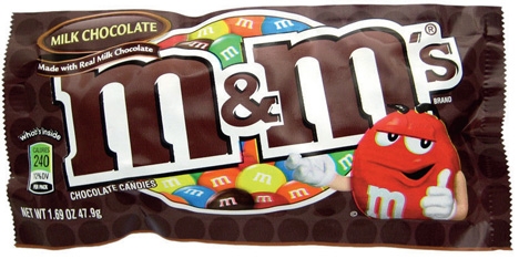
Looking at archetypal packaging design within the Jester archetype, M&Ms could be said to typify the best of the naive version of this archetype, living life as a game, with its use of playful, celebratory, popularist and involving design through its use of bright colours and cheeky, accessible characters. Ben & Jerry’s has more of maturing Jester profile, using its sense of fun to effect transformation, with its focus on rule-breaking design expressed through its use of non-conventional ’food’ colours and political/current affairs naming, such as Cameron Chew Chew, Hubby Hubby. Whereas Pepsi is a classic example of a wiser, mature Jester, content to live life in the moment, maximising unstructured design by using a variety of free-flow, high-energy backdrops that often have an optical effect.
Looking at archetypal packaging design within the Innocent archetype, McDonald’s is the naive Innocent, living in a state of childlike simplicity with elementary and overtly child-friendly design through its use of primary colours, basic shapes and Disney characters on its Happy Meals. Aveeno skincare is the maturing Innocent, where hope of renewal has replaced blind faith, with its focus on natural and clean design expressed through its use of a neutral colour palette, muted finish, oat-stalk visual, generous spacing and consistent application of elements. And Coke is the mature Innocent, where innocence comes from one’s own values, not experience, with its emphasis on hand-crafted and gentle design expressed through the elegant contours of its durable glass bottle; easy-flowing, rounded, ’script’ typography and the fluid graphic device that sits alongside.
Tailored archetypal design attributes are particularly useful in creative development for identifying which archetype an existing pack design is currently referencing, if any; how true to archetype its expression is and what opportunities there are to possibly express different attributes vs competitors; and also pinpointing any inconsistencies between the brand’s onand off-pack expression are you at one point in your archetypal journey in one but at a different level in another? It can inspire idea generation through clarifying which archetypal design attributes your brand needs to more strongly use to move forward and provide rich creative exploration of these. It can also provide a strong rationale for finished work and a framework for more objective evaluation of what your pack communicates.
Taking the time to translate archetype theory into design language makes it really useable and directional. And it helps us create standout packaging by using the right subliminal design codes to tap into consumers’ subconscious memory structures. Isn’t it time you released the archetypal energy at the heart of your brand?
Dorothy Mackenzie is chairman of Dragon Rouge
Read this next

-
Post a comment


