
Renewable supplier So Energy rebrands to “empower” customers
Studio Blackburn has created a new look for the renewable energy company which seeks to set it apart from its sea of competitors.
Studio Blackburn has rebranded renewable energy supplier So Energy with a “straightforward and simple” identity.
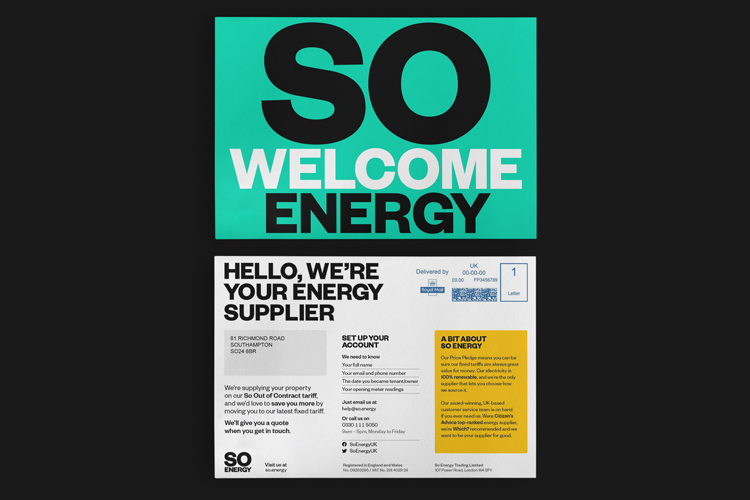
The work includes a new visual identity, digital billboard campaign as well as templates for customer communication. An app is also in development.
Established in 2015, the West London-based company hopes to serve a million UK customers by 2023. Its name derives from co-founder Simon Oscroft’s initials.
It supplies its energy through a range of renewable sources, including hydro, solar and biomass. Last year, the most significant source was wind which supplied 62% of its electricity.
Avoiding “sector vernacular”
Studio Blackburn head Paul Blackburn tells Design Week that there were two main considerations for the identity. The first was to avoid the cliché “sector vernacular” of energy branding, like clip-art images and childlike illustrations.
The second was to stand out from the numerous renewable energy suppliers. Many people’s route to finding a supplier is through aggregator websites, which means that identities often appear very small, Blackburn says.
“The role of aggregator sites is to suppress brand identities so we wanted to make it as distinctive and punchy as possible,” he adds.

The logotype is set in Founders Grotesk Bold and written out in all caps and in bold. The core identity is monochromatic but a suite of four colours are in use as well.
Red, yellow, blue and green have been used, which is changed from the previous identity’s “fairly muted” colour palette, Blackburn says. These have been used in an attempt to differentiate the brand from other brands.
The refreshed website has been designed in collaboration with So Energy’s in-house creative team. The studio worked with communications agency Common Industry, who set out a strategy for the company’s planned growth.
“Simple, straightforward and punchy”

The tone of voice is “simple, straightforward and punchy” as a way to entice people into making a change, Blackburn says.
“We found that people generally feel helpless in the face of these really huge issues, so we wanted the tone of voice to empower people with the sense of doing one thing that was effective,” he adds.
Studio Blackburn has also redesigned the templates for energy statements. “These were inspired by 8vo’s work for Visa around 30 years ago which is when people really started to think about the design of statement and bills,” Blackburn says.

Colour is used to highlight key pieces of information, the designer explains, and giving the viewer an “instant clue” about where to look first. The size of the font is also another aspect of this layout design.
A uniform typographic grid is in use as a way to give the monthly statements a sense of consistency, according to Blackburn.
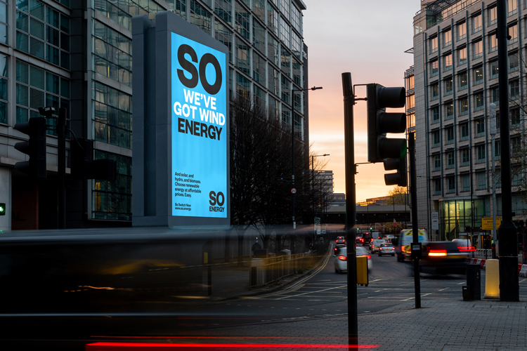
The logotype was initially designed with adaptability in mind, according to Blackburn. In the accompanying campaign, it can be separated to accommodate copy while also remaining at the forefront viewer’s minds.
One of the digital billboards, which can be seen across London, reads: “So we’ve got wind energy”. “So” and “energy” appear in black while the intervening copy is in white. This acts as a “brand repetition”, Blackburn says.
What do you think of the rebrand? Let us know in the comments below.


Great design/copywriting. But, SO will need keen fuel prices and exemplary customer service. I’m currently locking horns with Bulb. They are definitely losing me as a customer, regardless of design.
… and that’s the issue. You can have the greatest brand design in the world but if your customer support sucks people will walk away.
And yes I get that that is strictly out of the remit of the brand designer. But customer experience is all part of the larger brand.