
Breast Cancer Now rebrand puts patient and family experience “at its heart”
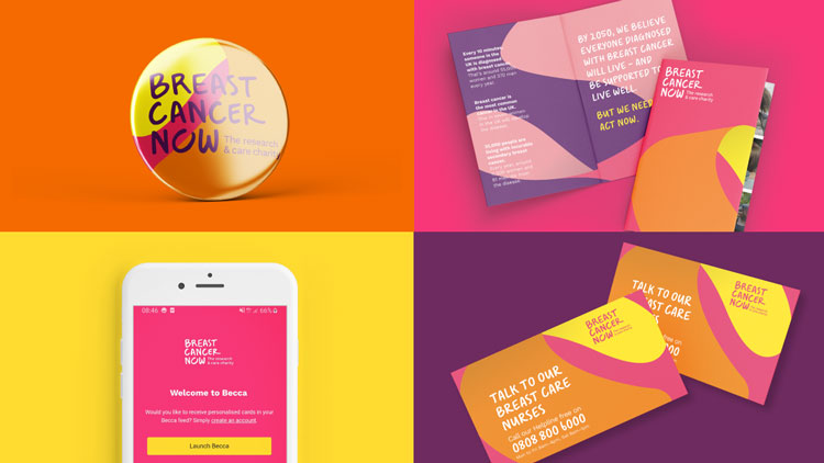
Headed by brand consultancy Wolff Olins, the updated visual identity features a new bespoke handwritten typeface, a colour palette and graphics.
UK-based charity Breast Cancer Now has revealed its new visual identity, just in time for the start of Breast Cancer Awareness month. The rebrand follows the merger of the charity with Breast Cancer Care back in April and represents the first visual identity from the newly united organisation.
“They basically needed a new story, and a new identity to back up that story,” says Emma Barratt, creative director at Wolff Olins. “We were mindful of the merger, and where we could we tried to include the DNA of the two charities.”
Creating a versatile colour palette
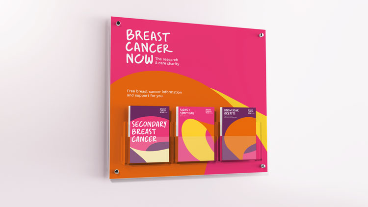
The colour palette is a nod to the previous branding of the two charities, and is comprised of pink, yellow, orange and purple. Barratt says the colours were carefully chosen to reflect the scope of the newly formed charity’s mission, which is concerned both with research and care, while avoiding some of the “pink fog” found across similar charities.
“We were really conscious on the colours, because the charity has to have several voices,” says Barratt. “There needs to be this bold, standout, eye-catching voice for the campaigns, hence why we dialled up the pinks and the yellows.
“But that’s not going to work for people who have just been diagnosed with cancer or has secondary cancer and won’t survive the illness. We needed to make sure the tone of voice and the colours therefore could be dialed down.”

The “embrace symbol”
Heavily featured in the new look is the charity’s new “embrace” symbol. Demonstrated by the incomplete “o” in the organisation’s logo, Barratt says the meaning of the symbol is open to interpretation.
“The symbol is about representing an individual’s journey, and that fact journeys don’t have starts and ends, they’re not complete,” she says. “But we also wanted individuals to apply their own meaning to it. You might see a breast, you might see a reassuring embrace, you might see a halo.”
For Fiona Hazell, director of communications and influencing at Breast Cancer Now, the symbol takes on a particularly poignant meaning: “[It] reminds us that although we’re making progress, breast cancer remains the most common cancer in the UK and 11,500 women and 80 men still die every year – so there is still so much more that needs to be done,” she says.
The symbol has also been rendered extensively throughout the project and can be found in 3D form throughout communications. Barratt says this reflects individuals’ lives. “When [the symbol] moves and rotates, you can see the different angles, in the same way different individuals have different angles in their lives while living with cancer.”
“It supports people on all fronts”
Wolff Olins has previously worked on numerous charity campaigns, including the British Heart Foundation and Macmillan Cancer Support. The team say extensive research was carried out before and during the project to ensure the identity best represented the people helped by the charity.
“We want people to see this is a charity that has a full range of perspectives that no one else has,” says Barratt. “It has this tenacious energy that will support people on all fronts.”


Does anyone know where you can buy this typeface from or what it’s called?