The railway station: Railtrack
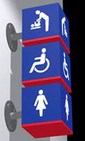
As part of a review of Railtrack’s identity, Citigate Lloyd Northover was commissioned to design a series of station icons and a wayfinding signage system for 14 of its major stations. The new signage follows the European regulations and has been designed to be accessible to the visually impaired station user. Implementation of the new wayfinding project in ten stations has been undertaken by Design Research Unit, which also produced a generic design manual for all stations that is intended to simplify the manufacturing process.
‘The project aimed to produce a consistent approach to wayfinding through a wide variety of environments. Many of the stations have been built over the past 100 years, with varying degrees of success,’ says Finn Butler, DRU senior associate and project manager. ‘As a result, the existing environments display very little natural wayfinding, highlighting the need for a highly visible rational wayfinding strategy.’ While three of the major stations – Gatwick, Paddington and Manchester Piccadilly – are already displaying the new designs, wayfinding implementation will roll out this year, with London stations Waterloo and King’s Cross among the first stations. The main defining feature is the rationalisation of hierarchy within each sign panel, so that the most important information is closest to the reader.
The previous wayfinding system belonged to a signing specification which was produced as part of the British Rail identity in the 1960s – incidentally, also by DRU. Yet the advent of private rail operators and of retail offers within railway stations have brought Railtrack to consider new solutions. Facilities that were previously branded, such as the Railtrack reception, will now be signed as station reception. The presence of new retail pods in stations like London Waterloo has increased pressure on Railtrack to display banners and other commercial wayfinding and advertising sites, says Butler.
‘Stations are not rail terminals any more, but places with facilities such as shops and coffee bars,’ says CLN vice-chairman Jim Northover ‘They are increasingly becoming destinations in their own right. All that needs to be reflected [in the signage]. Also, stations are all different. We take a view that we have to reflect the architecture of a place, the locality, give it a sense of place rather than a corporate branding.’ For Railtrack, CLN specifically designed the new typeface Brunel, in conjunction with type designer David Quay. The signs and icons for each station have either literal or metaphorical references, such as the traditional white rose of Yorkshire for Leeds city station or the crown and cross symbol for King’s Cross in London.
Read this next

-
Post a comment


