Updating the sign: The Imperial War Museum
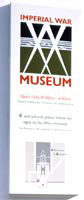
Launched in June, the new sign system by design consultancy Aukett Brockliss is the logical update of a previous scheme designed by Crispin Rose-Innes in 1989. Fundamental changes include white backgrounds and an increased size of type and signs, to improve legibility. Additional signs were introduced for the newly opened extension where the popular Holocaust exhibition is housed.
‘Our brief was to undertake a detailed study of all existing internal and external signs and make recommendations on improving wayfinding and locations of signs,’ says John Brockliss, managing director at Aukett Brockliss. ‘We were commissioned by the client to design and write a users’ manual that would provide some sort of permanent record of the job for the future.’ Aukett Brockliss was also asked to review all signs according to the Disability Access Report.
The final solution was achieved through close collaboration with the museum’s in-house design team, led by head of exhibitions Penny Ritchie-Calder and designer Henry Lyndsay.
‘The design of the signs is fundamentally restrained and simple, so it does not clash visually with the exhibits and interiors. The Gill Sans typeface – used in the old signing – was used for message display. Created between World War I and World War II, this font has been used extensively in the public domain. We thought it was appropriate for the military environment,’ says Brockliss.
Innovations include a free-standing stainless steel orientation guide, use of chemical brightening on signs and chemically etching illustration into aluminium. ‘Since its opening, the volume of wayfinding questions asked by visitors has radically reduced,’ says Brockliss.
‘The museum is not a terribly complicated building compared to some,’ says Ritchie-Calder. ‘But wayfinding to key destinations such as loos and special exhibitions has always been a weakness Aukett Brockliss’s advice – to take an approach more like that found in a sophisticated department store – proved sound.’ The crisp, legible signage is meant to be flexible, so new information can be added or amended according to circumstances.
-
Post a comment


