Mr Kipling launches new look just 12 months after last rebrand
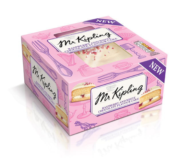
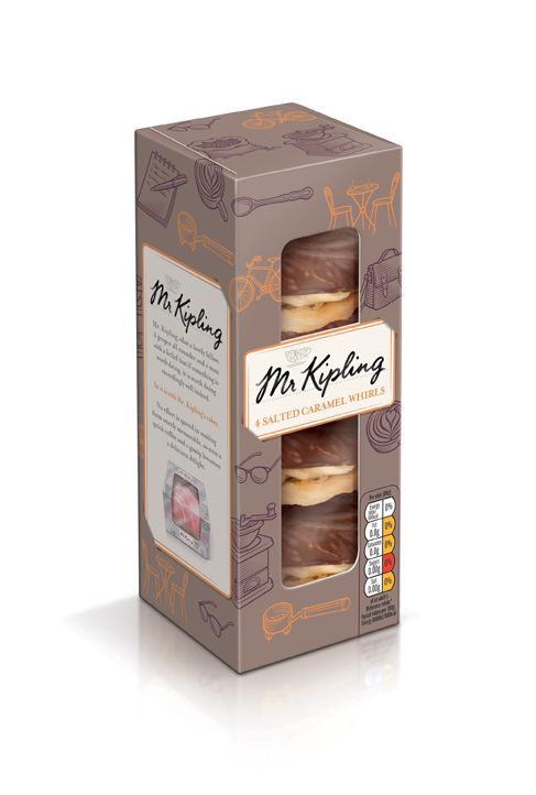
The new look, by BrandOpus, features illustrations and a “hand-written” Mr Kipling logo and replaces JKR’s 2014 rebrand.
Cake brand Mr Kipling is rolling out a new look just 12 months after its last rebrand.
The brand is launching new packaging, designed by BrandOpus, which features illustrations and a “hand-written” Mr Kipling logo. The “Exceedingly Good” strapline is used on the back of packs, according to BrandOpus.
The consultancy says: “Analysis re-affirmed the importance of the ‘Exceedingly good’ message that has always been inherent within the brand’s advertising campaigns and as such will remain a key part of the brand communication across the relevant touch points.”
Mr Kipling “signature calling card”
The consultancy adds: “We have brought the brand to life through the introduction of Mr Kipling’s signature calling card, which is tucked into each pack and allows him to proudly present his products.”
Helen Kemish, marketing controller for Premier Foods-owned Mr Kipling, says: “The packaging will make the journey down the cake aisle a more fun and uplifting experience for all and will form the start of a wider packaging re-vamp taking place across the entire Mr Kipling portfolio.”
Kemish says the new look will start to roll out more widely next year.
New Kipling products launching
Prior to that, the new look is launching on three new Mr Kipling products: Mr Kipling Fabulous Fancy, Mr Kipling Delectable Whirls and Mr Kipling Sharing Cakes.
Kemish says: “We are entering an exciting new era with Mr Kipling, reigniting the love shoppers have for cake and the brand.
“Cake moments are always enjoyable, whether celebrations, seasonal occasions or simply just snacking, and even better when shared.”
“Suggests he has personally signed each pack”
BrandOpus says: “We have worked closely with the Mr Kipling team to understand the key insights about the brand and the cake category, continuing the journey to unlock the enduring affection that millions of consumers have for this iconic British brand.
“The brief was to understand and leverage the brand’s latent heritage and values of discernment, quality and craftsmanship that had been lost over time and embrace them in a way that is relevant going forward.”
Paul Taylor, executive creative director at BrandOpus, says: “Our challenge was to bring the original values of Mr Kipling back to life. Establishing his signature as the brand identity suggests that he has personally signed off each pack, and with it, reassures that every cake meets his exacting standards.”

Mr Kipling’s existing branding and packaging designs have been on-shelf for just over a year.
The current look, designed by JKR, launched last August and features a redrawn identity with the “Exceedingly Good” strapline, which it was rumoured might be dropped at the time.
Speaking at the time of last year’s launch, Matthew Critchley, category marketing director of cake at Premier Foods said: “There were many rumours that Mr. Kipling was going to drop its “exceedingly good” end line.
“We know how much the public loves the ‘exceedingly good’ motto and we were never going to go against the Mr. Kipling ethos that has been part of national culture since 1967.”
Discover more:
• Mr Kipling overhauls brand and packaging
Read this next


Daft change. Once again the brand has attempted to look too premium for it’s own good. Dropping Exceedingly from FOP is a disaster too. I give it 6 months…
Nice use of clipart
I think its an impressive update, the calling card is a very effective touch. Not sure on some of the colour ways but I think the new packaging works a lot better for the personality of the brand than the current packaging.
A recipe for disaster: Take a memorable brand in the shape of a cake (err… that’s what they do) and completely mess it up with a generic card, and some marketing clap trap like he’s personally signed the pack… really??? Then clutter up the front with some faux Victorian clip art,and make it look way too premium and drop “exceedingly good” the thing everything remembers them for, then sit back and watch the sales go flat and go back to the drawing board next year…
Maybe I was too harsh in my wording, but the sentiment still holds. I’d like a go next time mr Kipling. Reasonable rates and friendly advice available here : )