JKR rebrands Stonewall to usher in “a new era of bold activism and pride”
The project has been worked on via the studio’s philanthropic arm, the JKR Foundation, and aims to showcase the charity as “the leader it is”.
Jones Knowles Ritchie (JKR) has unveiled a new visual identity for Stonewall, which hopes to mark a new era of “bold activism” for the LGBTQ+ charity.
Named after the Stonewall riots in New York City’s Greenwich Village, the charity was established in the UK in 1989. It was founded by activists lobbying against Section 28, the famously anti-LGBTQ+ legislation which prohibited “the promotion of homosexuality”.
Today, the organisation focuses its efforts on the wide range of issues still facing the queer community.
“A nod to the original sign”
The new identity will be rolled out across “every touchpoint” – from business cards and brochures to social media, events and out of home advertising.
At the centre of the work is a new brand mark, which combines an arrow device with an equals sign. This signifies how the work of the organisation is pushing forward.
The logo also makes up the “ll” at the end of the Stonewall wordmark, which is shown vertically in the new visual identity. Martin Francis, JKR creative director, says this is “a nod to the original sign” at the charity’s namesake, the Stonewall Inn, after which the riots were named.

A “modern twist” on the pride flag
He adds that throughout the project there has been a balance of LGBTQ+ heritage and “the organisation’s vision of its future”.
The introduction of two bespoke typefaces – Stonewall Loud and Stonewall Proud – is an example of this. The typefaces have been newly developed in partnership with F37 Foundry, but are inspired by protest iconography from decades past.
Another example is the rethought colour palette, which is informed by the LGBTQ+ movement’s well-known rainbow flag. Francis says JKR has put a “modern twist” on the palette – this will allow Stonewall to mix and match the colours to create “strong branded experiences”.
“Strong, kind, inclusive and energetic”
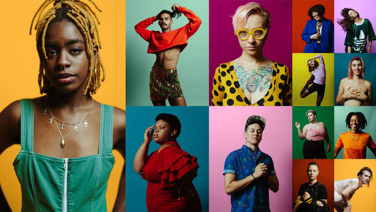
Francis says putting the community “front and centre” was a high priority for the team. He adds this has been achieved through “empowering” photography from photographer Ally Schmaling.
Schmaling’s photography aims to celebrate the diversity of today’s movement, Francis says, by showing the “modern and diverse faces” that it comprises.
The community has also been considered in the tone of voice. Stonewall needed to “sound like the leader It is”, Francis says, so a tone that is “strong, kind, inclusive and energetic” has been adopted.

“It was so important for us to ‘get it right’”
JKR worked on the project via its philanthropic arm, the JKR Foundation. This subsection of the international studio is focused on working with non-profits and social enterprises on a pro-bono basis.
To ensure the team was “doing the organisation justice”, Francis says members of the LGBTQ+ community were represented “at every level and discipline of the team”. The Stonewall leadership team also oversaw the project.
“It was so important for us to “get it right”,” he says.

-
Post a comment


