Johnson Banks unifies Action Against Hunger with new visual identity
The rebrand is designed to give the malnutrition charity greater visual uniformity across its different global outposts.

Johnson Banks has designed a new visual identity for Action Against Hunger, the charitable organisation fighting against global hunger.
Having built up a presence across 50 countries over four decades, the organisation has developed a complex system of branding, sometimes comprising local country names, other times its French acronym ACF (Action Contre la Faim) or a combination of the two.
Johnson Banks was briefed to find a “common ground” between all the countries Action Against Hunger is based in, and decided each country should adopt “Action Against Hunger” in its own language.
Greater uniformity
“We felt from the start that the full name was far more emotive, and clearly spelled out what they did,” says Michael Johnson, founder and creative director at Johnson Banks.
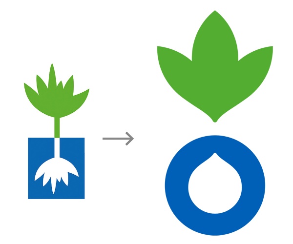
A new logo was also designed to allow for greater uniformity, based on the original blue and green illustrated plant and root symbol used for several decades.
Logo evolved from old symbol
“We agreed that a visual mark was imperative to ‘glue’ the organisation together, and it needed to evolve from the old symbol in some way.”
The new logo symbolises two key elements of Action Against Hunger’s work – food and water – while slightly tweaking the green and blue colours used in the original brand identity.
The consultancy also worked on a new brand narrative – “for action, against hunger” – based on the fact that there is a word for “for” and “against” in every language, as well as a design toolkit, comprising a lead typeface, Futura Bold, photographic and illustrative guidelines, and a two-colour livery.


Read this next

-
Post a comment


