UK press watchdog IPSO launches logo to tackle “fake news” and reader “cynicism”
The Independent Press Standards Organisation (IPSO) has launched a new kitemark logo, which will be worn “with pride” by member magazines, newspapers and websites to show their content is regulated.

The UK’s press watchdog has launched a logo that aims to combat the problem of “fake news” by giving newspapers, magazines and websites a form of accreditation and holding them to account if they report unethically.
IPSO born out of failed PCC after hacking scandal
The Independent Press Standards Organisation (IPSO) was founded in 2014 and replaced the Press Complaints Commission (PCC), which closed that year and had been the regulator of UK press since 1990.
The PCC was shut following the News of the World phone hacking scandal, which allegedly saw 300 victims subject to voicemail interception and phone hacking by the newspaper in the 2000s.
The PCC received criticism for not monitoring the newspaper closely enough and was scrapped, with then-prime minister David Cameron saying it was “ineffective” and “lacked rigour”. The Leveson Inquiry, which looked into misconduct in the press, was published and IPSO was founded.
IPSO regulates the press using the Editors’ Code of Practice, the official ethical code for journalists. This aims to hold newspapers and magazines to account for crimes such as intrusion into privacy, harassment and discrimination, and punish them accordingly. It also advocates for a free press.

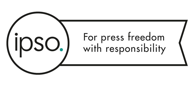
The new rosette-shaped logo launched by IPSO will be used on print and online versions of member publications, and aims to act as a stamp for “high editorial standards and public accountability”, says Niall Duffy, director of external affairs at IPSO.
It has been designed by advertising agency McCann London. In print and online, it will feature alongside contact details, complaint forms, and corrections and clarifications to articles, and it may also feature on the footer of homepages.
IPSO aims to prevent the logo being stolen and misappropriated by non-member publications by regularly checking online and “taking appropriate action” against misuse, adds Duffy.
“We’ll certainly scan the internet and I would expect our publications and their readers to do the same as well,” he says. “We’ll take appropriate action when and if we need to.”
A “badge of honour”
It features the organisation’s brand logo – which is the word “ipso” set in a black, lowercase version of sans-serif typeface Futura, with a fullstop in teal next to it – set inside a roundel, with a rosette tag coming off it.
The tag acts as a holding device for new brand motto “for press freedom with responsibility”, and the word “regulated”. It keeps the brand’s black, white and teal colour palette.
A rosette shape was used to indicate the idea of “British standards” and symbolise a “badge of honour”, says Mike Oughton, creative director at McCann London, while a flat, line-drawn, “pared back” look aims to be “graphic, simple and proud”. It aims to be reminiscent of IPSO’s existing brand, and “legible”.
The kitemark will be optional for use by IPSO members, which pay to be regulated, but IPSO is expecting a “strong take-up”, says Duffy.
“Even if readers don’t agree with content, the mark shows there is someone to complain to”
IPSO currently regulates 2,500 publications, which includes The Daily Telegraph, The Times, Daily Mail plus hundreds of other national and local newspapers.
Newspapers including The Guardian and the Financial Times, are not members of IPSO. The Guardian stated in 2014 that, given the failings of the PCC, it would not be signing up to IPSO, and would “reinforce its own system of complaints and mediation”.
“Even if readers don’t agree with the newspaper, magazine or website they are reading, this mark shows them that the content has been edited and curated and that there is someone they can complain to if they think the article has breached the Editors’ Code that we uphold,” says Duffy.
“In an era where the public’s trust in journalism has been undermined because of the rise of ‘fake news’, the new IPSO mark is a way in which [publications] can show they embrace high editorial standards and public accountability,” he adds.
“Fake news” a growing problem in online media
The concept of “fake news”, which is untruthful information published online to mislead and misinform readers, has become a problem in recent years with the growth of online journalism, and illegitimate websites passing themselves off as trustworthy sources.
The term has also been used by world leaders to deny allegations, most famously US president Donald Trump.
A watchdog – not “Murdoch’s lapdog”
Alongside the new IPSO rosette kitemark, a press and digital campaign will launch in early 2018 that aims to use “striking headlines and arresting illustrations” alongside supporting copy to educate readers about IPSO, “what it’s about and what it stands for”, says Oughton.
“Although not compulsory, the aim is for organisations to display their IPSO rosette accreditation with pride,” he says. “The public has a low awareness of IPSO, and the people in the know are quite cynical of them. The perception is that they are just a rebadge of the former PCC, with the term ‘[Rupert] Murdoch’s lapdog’ bandied about, which they are not. This aims to raise awareness of the independence of the organisation.”
He adds: “These are times when world leaders describe anything they don’t agree with as ‘fake news’ and referendums are influenced by misinformation. It is therefore more important than ever that we have a free press – with publications that have lots of different opinions and agendas – that conducts itself responsibly.”
The rosette kitemark has launched and will begin to be used by IPSO member newspapers, magazines and websites from now. The ad campaign will launch across newspapers, magazines and websites in early 2018.


The logo looks extremely insipid but, to quote Dr Johnson: “What is remarkable is not that it is done well, but that it is done at all!”
Will we be seeing this logo in Design Week and on all other Centaur Media publications?