
Hyderabad FC rebrand looks to fuse city heritage with digital future
The top-flight Indian football club has adopted a new look which includes a redrawn crest, new jerseys and other “off-pitch” applications.
India-based design consultancy NH1 Design has rebranded Indian professional football team Hyderabad FC in a bid to capture the attention of the club’s home city.
A relatively new club, Hyderabad FC replaced the nearby area’s previous club Pune City after the team was disbanded in 2019 following a series of controversies. The stakes in the team were sold, and its new owners moved the club from Pune to Hyderabad, changing the name in the process.
The new team began its first professional season later that year, and plays in the Indian Super League, the top-flight of Indian football. Despite high hopes, a quick turnaround in establishing the new club and its move to a different city meant that much about Hyderabad FC was rushed in the first instance. With the hope of moving forward and bonding with its new home city, the club approached NH1 for rebranding.

“Beyond the pitch”
At the centre of the new look is a redrawn club crest. Like its predecessor the crest features the Charminar mosque, Hyderabad’s most prominent landmark, but this time in a simplified format.
NH1 founder and creative director Neha Tulsian tells Design Week the intention was to retain and respect the city’s heritage while also ensuring the crest could be easily used in digital formats.
She explains: “Football crests have traditionally consisted of motifs derived from heraldry as they represented the city that they belong to, but over the past decade or so we have seen a shift.”
This shift, Tulsian continues, is down to teams needing to carve out an online presence. Intricate brand imagery doesn’t translate well digitally, so the NH1 focused on branding “beyond the pitch”, while thinking about “new-age implementations”, she says.

Standing out against “the vast sea of reds and blues”
Also found on the crest, and throughout the wider branding, is the HYD wordmark. Both this and the yellow and black colour scheme have been retained from the previous identity.
Yellow and black are also being used at the club’s jersey colours for its home and away kits respectively. Tulsian says that as well as being familiar, these colours will help the team stand out against “the vast sea of reds and blues” used for other teams’ kits in the league.
“[We also found that] across the world, not many teams use these two colours, which adds to distinctiveness and easy recognition,” she says.

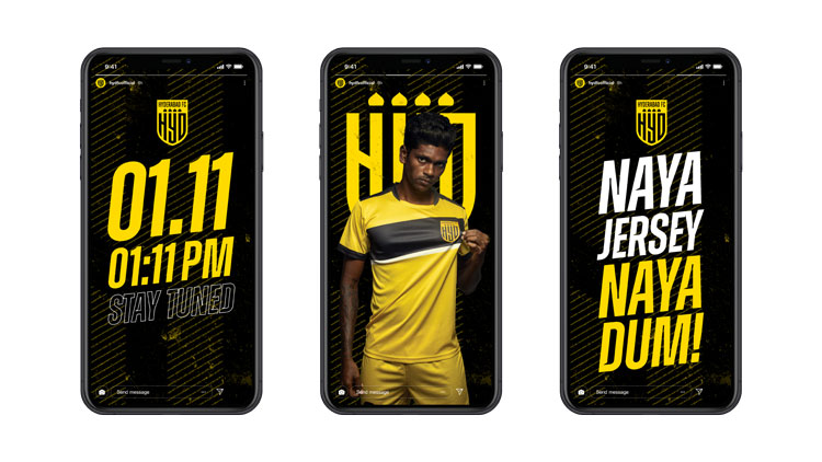
Digital applications
Owing to the pandemic, the new branding for Hyderabad FC was announced to fans online. New jersey releases were also done digitally.
Because of this, NH1 was also tasked with setting out social media guidelines and templates for the team.
“Instagram was identified as a popular medium to reach fans,” says Tulsian. For this reason, the team focused on creating content for this platform that would keep fans engaged, such as stories and a face filter.
Read this next


Dortmund. So what.
It’s odd. Looking at this work, and all I can think of is the work we did for Wolves. I had to do a double take at their font…