The Handmaid’s Tale to 1984: designers on their favourite book covers
To mark World Book Day 2019, we ask graphic designers about the books from the last year that they think epitomise great print design, from dystopian fiction to political commentary.

VNIITE: Discovering Utopia – Lost Archives of Soviet Design, by Alexandra Sankova and Olga Druzhinina
Designed by Tony Brook and Claudia Klat, co-founders at Spin Studio
Published by Unit Editions
“When asked to nominate the best of anything, it’s bad form to name your own work. But while I’m part of the company (Unit Editions) that published this book, I didn’t design the cover, so I’m unembarrassed to name it as my favourite book cover of the past year. It was designed by Tony Brook and Claudia Klat, and for me it does two things: firstly, it captures the spirit of the book (a study of Soviet-era design), and secondly it does this while simultaneously looking perfectly contemporary. It shows that a typographic cover can be just as effective as an image-laden cover.”


Middle England, by Jonathan Coe
Designed by Richard Bravery
Published by Penguin
“As a publisher, it is very hard to speak about a piece of cover design without also talking about how I feel about the book itself. I loved Middle England by Jonathan Coe — it was one of my favourite novels of 2018. But getting the cover right for a novel that is angry and serious but also funny and compassionate is such a hard thing. Jonathan’s books have had all sorts of covers over the years, some more successful than others, but everyone at Penguin knew when they read Middle England that it was an important book for the current time and we needed to come up with a jacket that would appeal to the widest number of readers. Richard Bravery in the Penguin General design team came up with this great concept, which we felt just nailed the mood of the book.”


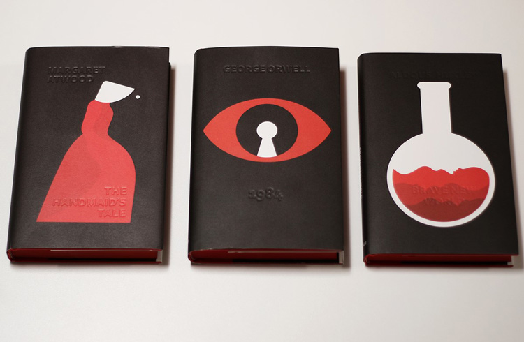
Nineteen Eighty-Four, by George Orwell; The Handmaid’s Tale, by Margaret Atwood; Brave New World, by Aldous Huxley
Designed by Suzanne Dean, creative director at Vintage Books, and illustrated by Noma Bar
Published by Vintage Books, Penguin
“The dark series of dystopian novels illustrated by Noma Bar stood out for me this year. It is incredible that some of these books were written as early as 1932 but are just as relevant today. The timeless, powerful themes in the books demand powerful and contemporary covers, and these deliver on both counts. The double read of the images (otherwise known as reversible images) paired with the ominous red and black palette deliver intrigue and that sense of unease and foreboding that you get on reading them. Penguin have built their image on great design – and their success and place as a much-cherished brand is testament to this.”

Fredrik Værslev – Fredrik Værslev as I Imagine Him
Designed by Zak Group
Published by JRP Editions
“To coincide with an exhibition of art by Norwegian artist Fredrik Værslev, Zak Group designed a complementary book. Drawing on the modernist references present in the work and the unusual techniques and untraditional tools used for painting (including trolley wheels and defective cans of spray paint), Zak Group created a cover that explores creative agency and imposition on the rational, the painterly and the architectural. This emerges, compellingly, in the intersection of bright graphic marks, digitally drawn from some of the artist’s canvases, running over a neutral black sans-serif, printed on raw linen. It’s visually immediate, sets up the content of the book well and alludes to the themes of the exhibition as well as the processes of the artist.”


How Democracies Die, by Steven Levitsky and Daniel Ziblatt
Designed by Christopher Brand
Published by Crown, Penguin
“Christopher Brand’s design is deceptively simple. Rightly eschewing any imagery that could project a partisan sentiment, he chose a bold typographic treatment that is still rich in cultural sentiment. The bold, condensed capitals are resonant of the protest posters and placards of the civil rights movement. The sobriety of the choice of monochrome again echoes moments of political and social reaction that, because of their urgency, did not allow for consideration of anything more complex or rich in colour. This is both a book cover and a prescient warning of the dangers of our times.”

What’s your favourite book cover design from the last 12 months? Let us know in the comments below.
Read this next

-
Post a comment


