Workroom’s perfect Sense
Creating a corporate identity to represent a group of disabled people is always a challenge. But designing an effective identity for Sense, which has grown from being a charity for the deafblind, to one for people with a much wider range of disabilities, is a communications conundrum to tax even the most imaginative designer.
Sense has used its ‘eye’ identity since the early 1980s, but has become increasingly dissatisfied with its limitations. Last year it appointed London design consultancy The Workroom, following a four-way credentials presentation.
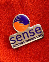
‘After wide stakeholder research, we discovered this logo wasn’t liked or understood, nor did it give an accurate impression of the charity,’ says The Workroom creative director Brigid McMullen. ‘The new identity encapsulates the deafblind person’s most important and fundamental method of communication with the outside world – touch. It also encapsulates the human attributes associated with the organisation itself: communicating, caring, supporting, guiding and being there,’ she adds.
The new identity sees intertwined hands, coloured orange and blue, forming the shape of the letter S for sense. Underneath the redesigned motif, a more contemporary Sense logotype is followed by a new strapline: Touching People’s Lives. It replaces the descriptor, The National Deafblind and Rubella Association, which was hefty and an incomplete description.
The new annual report and stationery relaunches the corporate identity, which will then be applied to signage and other literature. The retail facias are still under consideration.
Client: Sense
Head of communication: Stephen Bromberg
Design: The Workroom
Design Team: Brigid McMullen, creative director; Martin Devlin, creative director; Jo Walker, designer; David Hares, designer
-
Post a comment


