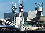
The Lowry shop, Manchester

Stephen Hetherington, chief executive of The Lowry, was responsible for overseeing the interior, architectural and graphics applications for The Lowry’s immense physical structure, which was designed by architect Michael Wilford. ‘The Lowry features a very simple, open plan interior that doesn’t detract from the stunning architecture,’ Hetherington explains. ‘Commercial outlets within The Lowry had to conform to the overall design. The last thing we wanted was outlets resembling plug-in after-thoughts.’
Wilford specified a neutral and ethereal design that would complement and preserve the integrity of the building. Shop designer, Phil Dore of Dore & Dore, worked with the architect and design consultancy Point Eight to find a balance between these requirements and the needs of specialist art bookshop, Zwemmer. ‘Spatial layout, retail operational requirements and design aesthetics were also important considerations,’ says Dore. ‘We went through a long period of negotiation and compromise to achieve outlet designs that suited everyone.’
One solution was to use the same or similar materials already specified for The Lowry interior. These materials include glass, stainless steel tiling, timber flooring, perforated stainless steel gauze dividers and white finishes on walls and furnishings with edgings in metallic-look, powder-coated finishes. The Lowry logo, created by The Chase, can be used on almost any medium. The logo design emphasises its location rather than any single art form. ‘We didn’t want The Lowry to be linked with the idea of a place for singular activity, but a venue that opens doors to both cultural and personal experiences,’ says Hetherington.
-
Post a comment


