Skin deep
A poor execution or inappropriate paper stock can let down the best of ideas. Yolanda Zappaterra looks at three publications that use paper to striking effect
Last month, millions of households in the UK got their own little bit of high-end printing, courtesy of Sky, which sent subscribers a special version of its customer magazine to convey the brilliance – literally and figuratively – of its high-definition service. The words ‘feel everything’ were emblazoned across the cover in silver metallic ink and a coated card tip-in featured the kind of psychedelic swirly image not out of place in Dr Who, souped up with double-hit spot varnish. As a metaphor for the service, it worked well, but it was let down by the fact that the rest of the magazine looked terrible – text was muddy, bowls were smudgy, trapping was badly set, plates were slightly misaligned and the stock was thin, resulting in a publication that completely undermined the high-definition message. ‘There’s no point having an idea that is poorly executed,’ says Bryan Edmondson, director of Sea Design. With careful execution of stock and printing, this needn’t be the case, as our three case studies show.
Soda magazine, designed by Martin Lötscher
Printed on Ziegler papers by Benteli Hallwag AG, Switzerland (Soda #26)
Annual Swiss magazine Soda, founded by graphic designer Martin Lötscher in 1996, combines startling and provocative imagery with some of the best emerging print technology to deliver visually dynamic dialogues. ‘The title is the German expression so da, like the French word voilà, which means “there it is”,’ says co-editor Iris Ruprecht. ‘But,’ she adds, ‘it is also, importantly, a reference to Dadaism and its way of seeing things.’ This is important, because the Dadaist collaborative approach is at the heart of Soda – each issue takes about five months to produce and is the result of an intensely collaborative process that includes printers and paper suppliers, explains Ruprecht. Issue 26 had the theme of ‘surface’ and presented a visual world that had to be ‘read’. It required a mix of very light opening pages, followed by a standard paper, whose surface structure could take complex ultraviolet printing processes. The opening pages were printed on a light paper, normally used as an instruction leaflet for medicine, Z-Pharma 50g/m2 from Swiss manufacturer Ziegler Papier. The standard paper was Magno Star 135g/m2 and the cover Z-Offset Ziegler Papier 250g/m2, coated with a K Laser Technology hologram foil. Thanks to the large number of readers involved in printing activities, Soda has built a productive relationship with paper companies. ‘They know very well how effective we are at promoting their goods in our publications,’ says Ruprecht. Order a couple of back issues and you’ll see what she means.
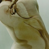
Closed Contact by Jenny Saville and Glen Luchford, designed by David James Associates
Printed on Parilux by St Ives Westerham Press
When UK art galleries, such as the Tate and Whitechapel, want archival quality excellence for their publications, there’s a good chance it will be Lloyd Bromhead at Westerham Press who will produce it for them. Closed Contact, printed for the Gagosian Gallery, stands out as a particularly impressive piece of print. The large-format book features photographs of the artist shot through glass by fashion photographer Glen Luchford, in which a naked Jenny Saville presses and folds her flesh into abstract landscapes and surreal representations of the body. Printed lithographically on archival paper Parilux, it was a complex job to reproduce the concept of Saville’s performative artworks, ‹ and one that was ‘extremely challenging’, recalls Bromhead. ‘To achieve the desired effect, we used special colours within the print process and spot gloss ultraviolet varnish on the photos. We worked with Saville and Luchford to decide the best substrate and printing technique,’ he says. The mesmerising results are something Bromhead attributes as much to enthusiasm and willingness to experiment as anything else.
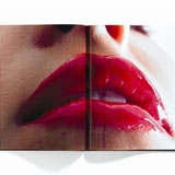
Surface Seduction by GF Smith, designed by Sea Design
Printed on Phoenix by Moore
Bryan Edmondson is a bit of a paper buff, so when it came to designing something that would show off the capabilities of German mill Scheufelen’s new stock Phoenix, distributed by GF Smith, he turned to Rankin for the photos and Keith Arnold at Moore for the printing of an extraordinary catalogue. ‘I pretty much had a clear idea, at the outset, of what I wanted to do, as I’d used the paper in the past and knew the surface was unique, which was part of the idea of Surface Seduction,’ recalls Edmondson. Thus, the concept was given to Rankin as, ‘the idea of beauty and details of the body, such as the so-called skin beauty of the lips to the not-so-beautiful stubble in an armpit. The idea was liked straight away, as skin tones are a great test of print on a good paper’. The book uses a combination of random dot and stochastic screens, along with different varnishes throughout, including matt seal, matt varnish, gloss varnish and ultraviolet varnish. Taken together – and with a wealth of detail on the different finishes, techniques and coatings in the inside back cover – the whole acts as an astonishingly sumptuous book in its own right, but also as a mine of information for designers.
Read this next

-
Post a comment


