Smart cards
As Abbey prepares to relaunch its credit cards, David Benady looks at how banks are using eye-catching card designs to attract consumers
As Abbey prepares to relaunch its credit cards, David Benady looks at how banks are using eye-catching card designs to attract consumers
As UK consumers rack up mounting debts on their credit and debit cards, the design industry is attempting to turn the beloved plastic strips into objects of desire, by creating distinctive branding and radical new formats.
The nation’s 137 million credit and debit cards have been compared to portable advertising hoardings for card brands, which say as much about those carrying them as the clothes they wear or the cars they drive. In a mature industry, where US entrants, such as MBNA and Capital One, have forced credit cards into an interest rate war, established providers are looking to use branding as an alternative to fighting on price.
Lloyds TSB’s recent appointment of packaged goods design specialist Jones Knowles Ritchie to rebrand its debit and cash cards underscores the card industry’s desire to employ the traditional branding techniques of fast-moving consumer goods.
It is the first redesign of the bank’s cards since Lloyds and TSB merged in 1997, when the heritage and identity of both banks needed to be represented. JKR chief executive Andy Knowles declines to reveal details of the new designs rolling out later this year, but says the agency will use some of the same tactics it has employed to create distinctiveness in the packaging design of grocery brands, such as Stella Artois and Heinz.
‘Most people have more than one piece of plastic in their wallet, and anything that helps you find the card and grab it is a benefit, as is anything that helps you feel comfortable in the display of the brand you use,’ he says.
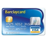
JKR could look at the experience of Barclaycard, which was updated two years ago by Interbrand after the card’s trademark gold and blue came to look rather stale. The new Barclaycard features a B-shaped edge, serving as its logo.
Interbrand creative director Jonathan Hubbard says, ‘We didn’t want to throw away the past. There is a strong visual heritage in the colours blue and gold, which links back to the Barclays Bank brand. The card needed to be blue and reflect the gold, and have something new, fresh and motivating for younger customers.’
A card may be a small canvas for designers to express themselves, but Hubbard adds, ‘In credit card designs, the more whizz-bang you can get on the card, and the more graphic tricks there are, the more aspirational it looks. You are using the credit card almost as an above-the-line advertising medium. We felt we needed to simplify that, instead of having visual identity and the brand. You make sure your logo is your card and the card is your logo.’
Other radical format designs include the launch, by Halifax, of a transparent credit card, through Cardiff-based design group Elevator, which was intended to show the transparency of its offer, though this card has been discontinued.
The bank has also launched the Halifax One Card, also created by Elevator, which features a starburst design. Elevator owner Stephen Braham explains, ‘The brief said there were features of the card that were better than any other in the market, with a longer interest-free period and a lower rate for all. They explained it as a really dramatic moment in the credit card industry and our brief was to capture that.’ He says the starburst design was chosen to suggest the dawning of a new day, or a fresh beginning.
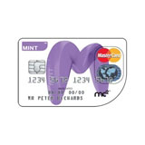
Another ingenious design is the in-house-designed Mint Card, which offers a version with a curved corner, giving it strong youth appeal and a powerful point of difference. But some observers believe there have been problems using the curved Mint Card in some cash machines, though the company denies this.
One of the biggest shifts in card design over recent years has been caused by the arrival of low-rate cards. The new entrants have disrupted card design conventions by widely using gold and platinum cards – colours once reserved for the premium sector. Some argue that the traditional currency of colour-coding has been so devalued that card brands are having to create their own premium identities. At the same time, there is a move away from gold, which has come to be seen as increasingly downmarket.
Upmarket bank Coutts has launched a card created by fashion designer Ozwald Boateng, which uses his signature colour purple, communicating ‘modernity and supreme elegance’. Coutts head of banking products Alison Langton says, ‘Credit cards are one of the few things that people can use to show they are a Coutts client.’
A revolution is on the horizon, with the introduction of pre-pay cards, aimed at teenagers, which are branded with their favourite magazines. Meanwhile, Transport for London’s Oyster travel card points to a cashless society, where even small purchases can be made on pre-pay cards.
As consumers’ wallets get fatter – laden down with loyalty cards, donor cards and travel cards, as well as good old plastic cash and credit – ensuring the cards have a distinctive look will become a central concern for designers.
Bank card design
• Jones Knowles Ritchie is working on a redesign of debit and cash cards for Lloyds TSB
• Turkish bank Garanti this year launched a credit card designed by Twelve Stars
• Barclaycard relaunched in 2004 with a card design by Interbrand
• Fashion designer tie-ins: Alexander McQueen’s American Express Centurion card and Ozwald Boateng’s Coutts card
Read this next

-
Post a comment


