First impression
Business cards may reveal your true character, but a book of cards designed solely by creative types soon becomes monotonous for Quentin Newark
There are only so many types of graphic design book. There’s the profile of a studio, an individual or a moment in time, a survey of a type of work (recent illustration, for example), or a book about theory. And then there is the kind like Business cards: The Art of Saying Hello, where you empty out your pockets and photograph the contents.
The book suggests that your card is so important, such an essential presentation of yourself, that it bares ‘your soul’. That’s a tall order for a piece of card. The entire premise of this book is wrong. Business cards are not about saying ‘hello’ at all. You say ‘hello’ with your mouth when you meet someone. Cards are about saying, ‘Here is my phone number, don’t forget me.’ They are less about pizzazz and more about information. No matter how far the typography pushes the envelope, if the e-mail address is too small to read the card is pretty useless.
For some reason, almost all cards are the same size. The designers featured do everything they can to try to escape the boundaries of the content and the format, and the book’s pages abound with scribbling, rubber stamps, foil-blocking over photographs, handwriting, wobbly drawings, plastic and Perspex. There’s also lots of surfer and skateboard graphics; clashing type of the post-David Carson variety, some actual Carson clashing type, Gothic letters, fake 1950s logos, fake vernacular lettering and graffiti. And lots of toys and Star Wars stormtroopers (some of the designers featured are really young).
Of course, among all this, understatements stand out a mile. Like all the cards that concentrate on simple textural effects: Ã…bÃ¥ke’s blue type floating over lovely blue graphic patterns for Scarlet Projects, for example, and several of Sea’s elegant designs featuring plain foiled type into thick card.
Anything that has some thinking behind it really screams at you. Like the cards for Mother, each one showing the mother of the person named on the card. Dozens of mothers, every one strikingly different. One shows the ‘proud mother of Natalie Phelan’ as a child, just starting out on her own life, completely unaware of the child she will one day give birth to. One shows the mother of Cecilia Dufils, heavily pregnant. This is unexpected, emotional and personal in a way that oodles of scribbling and messy type can never get close to.
My favourite (not that I haven’t see the idea used before) is Karen Jane from the Royal College of Art, who uses a sticker that she attaches to other people’s cards, or Tube tickets, or bits cut off proofs. Low cost, cheeky and competitive, it’s like a miniature version of fly-posting. Every card is unique.
The book confines itself to the cards of the authors’ mates, so most of the cards are from similar designer types. None of the cards are older than a year or two, only a few for clients. With a scope this limited, the content quickly becomes repetitive, the designers drawing on such similar sources, such a similar moment in time. I craved cards from different sorts of organisations like Halliburton or the military, from the other-worlds of Nasa, the Soviet Union, Africa, 1950s America, the 19th century. What was Bernard Shaw’s card like, or Harold Wilson? How did Warren Beatty give out his phone number? That’s something worth knowing.
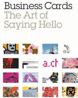
Business Cards: The Art of Saying Hello, is published this week by Laurence King, priced £19.95
-
Post a comment


