Start-rite looks to put best foot forward with rebrand
Studiosuther& has introduced a walking wordmark to bring “playfulness and joy” to the 230-year-old brand, which is being repositioned as an expert in children’s footwear.

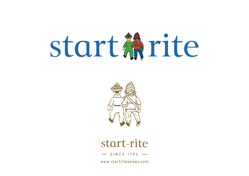
Studio Sutherl& has rebranded children’s footwear business Start-rite, introducing a new logotype, that features the feet of illustrated twin characters who have been part of the brand since the 1930s.
It is part of a new strategy which posits the company as an expert in its field, able to create shoes for specific needs so that any given pair fits the child as well as the foot and allows them to move freely.
The heritage brand has been in business for 225 years and Studio Sutherl& – which worked alongside brand specialist Jo Graham consulting – was tasked with interpreting the new positioning in a contemporary visual way while recognising the legacy of the brand.
Start-rite twins redrawn
The Start-rite twins have been redrawn to look like children rather than dolls, which frees them up from their constraints within the logo. No longer part of the logo lock-up, the redrawn twins are now deployed elsewhere across the branding.
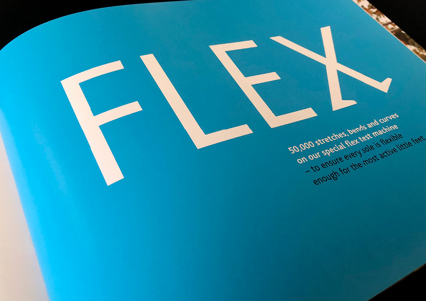
Typographic walking twins are captured within the logo and a bespoke “Typefeet” font has been designed so that Start-rite can work on further materials. Crucially the serifs become small feet. Bliss has been used as a secondary font.
Type is set in black and white, sometimes with a sky-blue highlight colour. It is often used alongside photographs shot by Fiona Burrage showing children at play.
Brand “had been diluted over the years”
Jim Sutherland of Studio Sutherl& says: “What’s been so fascinating about this challenge is that we have radically modernised the brand while in fact returning it much closer to its original pioneering routes.
“Start-rite’s communications in the 1930s and 1940s were full of a sense of adventure, something that seems to have been diluted over the years. We wanted to add some playfulness and joy to everything”
Although the brand has come to be seen as conservative, in the 1940s “it challenged perceived wisdom about children’s footwear” according to company CEO Ian Watson.
“Keep exploring”
A new website is on the way, as well as digital and print communications and a “keep exploring” campaign.
Studiosutherl& has worked on print and digital ads featuring still life product shots and close-ups, which have been turned into abstract landscapes for the twins to explore. These will be accompanied by short films made for social channels showing different ways children move.
“The typographic twins work as a shorthand while the twins themselves go on an adventure round the boxes, across the building, on the soles of the shoes…” says Sutherland, who instructed illustrator Rebecca Sutherland to draw a silhouette of the twins.


Read this next


Rebranding is supposed to move a brand forward. This solution looks as old as their very original. What a shame.
I like it, simple and subtly clever.