Film production company says “f*ck you” to sexual harassment with branding
Female Union Films, a new production company, has been given a bold, monochrome visual identity by design studio Ahoy that aims to promote gender equality in the male-dominated film industry.
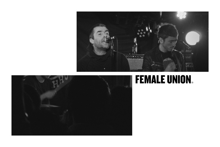
The company was founded last year by Nickie Sault, who has worked as a producer for 20 years alongside filmmaker Shane Meadows on films such as This is England and Bronson, as well as music videos for Liam Gallagher.
Female Union Films was founded out of the sexual harassment scandal that was exposed across Hollywood last year, in particular allegations surrounding film director Harvey Weinstein, and the #Metoo campaign that followed in protest against gender inequality.
The new film company looks to promote gender equality in the industry through employing more women in production roles and on-screen. Female Union Films has not confirmed at the time of publishing what else it will be doing to promote the cause.

Ahoy has branded the new business, with a monochrome colour palette and an all-caps, sans-serif logotype, accompanied by strike-through lines. The core logotype and copy typeface is Knockout, designed by foundry Hoefler & Co.
Another core visual asset is a mock-American flag, the main component of which is two “X” symbols to represent female chromosomes and the idea of “resistance”. It aims to be a literal representation of how Female Union Films is “carrying the flag for women in film and spreading the word that success has no gender”, says Rick Raby, designer at Ahoy.
Moving animations of the branding depict text being erased, replaced with strike-throughs and then reappearing, to depict protesting against censorship, says Raby.
The expanding and contracting of text also creates a “responsive and versatile” identity, he says, allowing the company to use the “no-nonsense ‘FU’ abbreviation” when necessary.
Raby says: “We were led by the idea of anti-censorship and empowering women,” he says. “That’s what Nickie’s brand is all about, and that’s why we used the strike-through symbol. The black-and-white palette and block letters also have a punky aesthetic to them. Given everything that happened in Hollywood last year, it is meant to be very literal.”
The company is yet to launch a website, as it sources work primarily through contacts, says Raby, such as [Shane] Meadows and Channel 4. Ahoy is exploring designing a website for the company in the future. It currently has a Twitter page.


This just goes to show how powerful of a statement design can make! Reminds me a bit of the Berlin Feminist Film week’s campaign this year — great, strong, unapologetic sentiment that should inspire us all.