Leonardo DiCaprio Foundation reveals playful branding for wildlife funds
The wildlife charity has launched the Shark Conservation and Elephant Crisis funds, and Superfried Studio has given them visual identities that trick the eye with optical illusions.

Superfried Studio has designed the branding for two animal protection initiatives by wildlife conservation charity the Leonardo DiCaprio Foundation, which look to protect sharks, sting-rays and elephants.
Hollywood actor Leonardo DiCaprio set up the self-named charity 20 years ago, with the aim of protecting wild animals and their surrounding environments.
The two new projects from the charity are the Shark Conservation Fund, and the Elephant Crisis Fund, two grants to protect elephants, sharks and stingrays. They are part of two wider initiatives by the charity, which are Wildlife and Landscapes, and Marine Life and Oceans.
Manchester-based Superfried Studio has created two brand identities to represent the two funds, both of which use optical illusion to create several simultanous images within each logo.
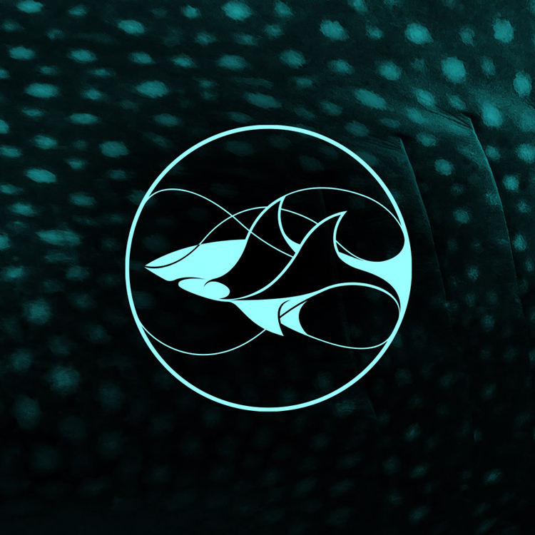
The Shark Conservation Fund identity features an aqua-coloured, solid shark symbol, layered over with a line-drawn ray symbol, both encapsulated within a circle outline. The wing of the ray becomes the fin of the shark, while also creating the image of ocean waves.
The idea was for the visual identity to “simultaneously represent both species [shark and ray] and their natural habitat”, says Superfried Studio’s creative director Mark Richardson, as the organisation aims to protect all three things.

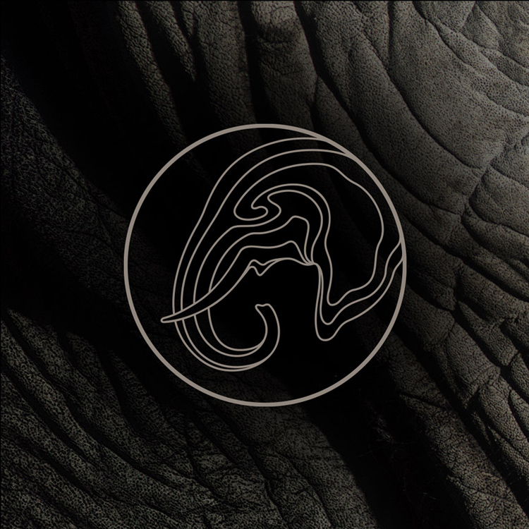
Similarly, the identity for the Elephant Crisis Fund features a grey, line-drawn, profile image of an elephant, which has been filled in with topographic contour lines to demonstrate the landscape. Contours lines are used on geological maps to demonstrate how the earth’s surface rises and falls in a particular area, such as with hills and slopes.
“I am a big fan of op [optical illusion] art, especially M.C. Escher,” says Richardson. “I am always looking to simplify, and whenever possible, try a new direction that I have not explored before. So if I could represent both species within one expression, rather than having them as two separate entities, I felt this would lead to a more intriguing and elegant solution. The ocean waves and shark fins were conveniently similar in shape.”
A pattern palette was given to both brands, allowing the symbol-based logo to be stamped on top of various backgrounds.

The patterns also have a double-image effect, representing the texture and patterns of animal skins while also resembling the landscapes in which they live. The Shark Conservation Fund features patterns of ray and shark skins, which also resemble ocean scenes, while the Elephant Crisis Fund features patterns of elephant skin, which also look like “parched landscapes”, says Richardson.
An appropriate colour palette was given to each fund, with an ocean-inspired green, aqua, blue and purple palette ascribed to the Shark Conservation Fund, and a earth-inspired grey and brown palette ascribed to the Elephant Crisis Fund.
Richardson says the main reason for creating brands that trick the eye and cause people to look harder was to “connect with people” and “cause them to take notice, therefore raising awareness for the important causes”.
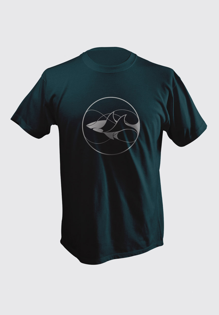
“There are a lot of animal-based identities out there, so I wanted to make them stand out when in complete isolation with no wordmark for support,” he says. “Hopefully they also look good enough for someone to wear on a t-shirt!”
The branding for both initiatives has now rolled out online, across print and marketing materials such as campaign posters and business cards, merchandise and will also be used on in-house collateral such as branded vehicles and t-shirts for those undertaking conservation work.


There is an immediate inherent problem with this branding. The line thickness will not stand up at a smaller size. Try reducing it and using as a supporting brand logo and it would lose all clarity.
…and having taken a look at the website, my point is proven.