Australian island Tasmania gets a new brand that embraces its “hard landscape”
The new identity embraces the isolated region and its “harsh weather” as it urges people to explore further, spreading the message through open-source branding which is free for locals to use.

New branding for the West Coast of Tasmania has set out to “breathe new life” into the remote region by embracing its “rough and ready” nature and sharing its identity with the world.
Tasmania is an island state off the South Coast of Australia, which is relatively isolated from the mainland, and known for its wilderness, rough land, protected parks and other natural reserves.
The design project, completed by studio For the People, aims to attract more tourism, business and residents to the region as well as improve its economy. It aims to encompass the area’s people, places and stories within the branding, the studio says.
Jason Little, creative director and co-founder at For the People, says understanding the region’s history has been important to the project, particularly the past 150 years when it was a site for “mining and pining” – in other words, mining for various metals and minerals, and logging, which is the cutting and processing of trees to make different produce.
“At one time, the West Coast boasted a population of over 30,000 people,” he says. “But as mining gradually dried up in some communities, and conservation has shifted the economic reality around the profitability of these industries, the region’s population has shrunk to 4,000.

“The critical question that Tasmania’s West Coast was asking about its future was: how can we curb the decline, and connect to a new narrative that will pave the way for the future, while preserving our past?’”
The West Coast community expressed the need for a new brand “to showcase the region’s rich identity to the world” he adds, as part of a plan for the region’s future developed with the local council.
Keen to develop a narrative that was “honest” and “a true reflection of the stories, heritage and personality” of the region, the branding has not shied away from the region’s “remoteness” or that it is a “hard landscape with even harsher weather and nature”.
Little says: “The truth of the West Coast is that its harsh and unforgiving weather has always forced people to live on the terms of the land. But this tension produces interesting things: ingenuity, craft, stories, and new ways of thinking.”

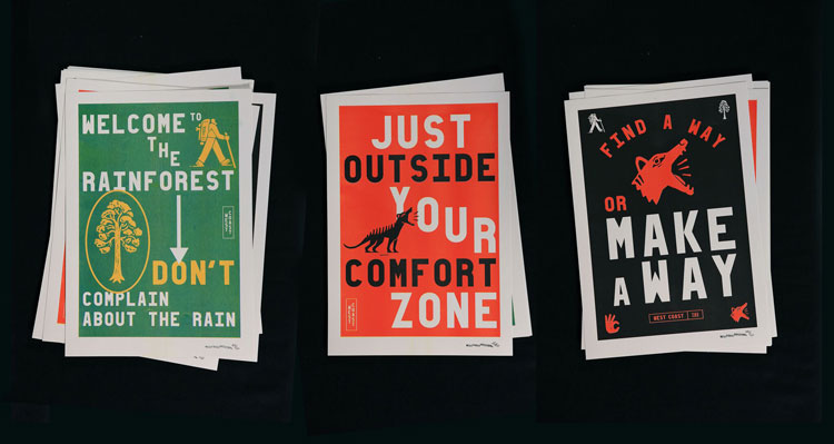
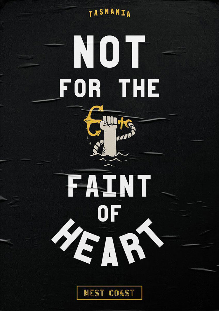
Slogans throughout the branding include: “not for the faint of heart”, “gravel not grass”, “in nature we trust” and “take a step in the wrong direction”.
“The language explores and embraces the idea that this place isn’t for everyone, that you need to have a little resilience and acceptance of the imperfect,” Little says. “As one local said: ‘If you can’t get something, you make it. If you can’t make it, you make do’.”
The words “West Coast” appear in all-capitals, inside a rectangular outline, to form the logo, which appears in various formats.
Bright, contrasting colours feature throughout the branding such as blue, orange, green, black and white.

A set of icons include images of various animals, people taking part in activities such as mountain biking and symbols of nature such as trees and waterfalls.
These have been developed with Australian illustrator Marco Palmieri, and are used alongside copy that helps tell stories about the region’s environment, personality, past and present, according to the design studio.
As well as the identity, assets created by the studio include a bespoke typeface, iconography, and a photography library.
A selection of photographs shot by Borja photographers Ollie Khedun and Hayden Griffith have also been used, which include atmospheric shots of individuals exploring the region’s natural landscape, never looking at the camera.
“We deliberately tried to express the relationship between the scale and power of nature to mankind, often thinking in terms of 10:1 scale, while maintaining anonymity of the people to help the viewer see the potential of themselves in the shot,” Little says.
Sans-serif, all-caps typeface Sidetrack has been used throughout the branding. Little says: “We developed this master typeface with typographer Mathieu Réguer, and it references the prolific, large-scale sign-painted typography that appeared throughout the region during the settlement and mining boom.
“We based it around a Universal Stencil Plate, a lettering device invented by Joseph A. David in 1876. It features a complex grid that allows its user to trace any letter, numbers or punctuation shape, enabling numerous non-professionals to produce crude but consistent lettering in a very efficient way.”

The studio has created different iterations of this typeface and teamed it with Work Sans, a free-to-use, open-source Google type.
The studio aimed to involve the community throughout the branding project. Working alongside the West Coast Council, it ran a “community engagement” programme to gather insights and feedback throughout the process from a wide range of local people, from school children to councillors.
The branding is available to use for anyone in the community, from local residents to tourism operators.
“As an open-source identity system, every aspect is free to use by locals in the region, providing the tools to communicate effectively, where these would normally be cost prohibitive to anyone but large tourism operators,” Little says.
He hopes that with access to the brand guidelines, “the region can convey a coherent narrative and regional style, while maintaining the individual personality of each town, business or initiative.”
He adds that he hopes the new branding will” empower” local residents and “help to attract visitors, businesses, residents and investors” to the region.
All project photography © Ollie Khedun and Hayden Griffith


What a wonderfully witty and joyful campaign from the creative talent down under. They made me smile on this chilly November morning here in the UK.