
Big Issue redesign: “It’s not just about the homeless – it’s also about culture”
The weekly publication given out by street vendors in cities all over the world has a new design that looks to showcase all the magazine has to offer, while still “giving a voice” to the people it hopes to help. We speak to art director Ross Lesley-Bayne about why the Big Issue was due a refresh.
The Big Issue print magazine has had a redesign, in a bid to demonstrate the breadth that the magazine covers, from regional news and features to arts, culture, music and travel.
The redesign, which has been completed by the Big Issue’s in-house creative team, also looks to attract new readers to the magazine, while making existing readers feel “more involved” with the publication.

It launches with this week’s issue, which marks the centenary of the end of the First World War and features an investigation into how to help homeless veterans on its cover.
The Big Issue launched in 1991 as a weekly publication to raise awareness of the homeless community in London and to offer them opportunities for employment and for raising money.
It has a unique model in which volunteer street “vendors” are employed to sell the weekly magazine, many of whom are homeless or living in temporary accommodation themselves.
The vendors – or “micro-entrepreneurs”, as the Big Issue calls them – buy the magazines from the publisher for £1.25, then sell them on for £2.50, making a small profit each time. The idea is to get them “working, not begging”, making it “vitally important that buyers take their copy of the magazine when they pay for it”, says the publisher.

However, the magazine also has a regular subscription model, where readers can subscribe to issues online, and buy back issues.
Since launching in London, the magazine has expanded, and now prints four regional versions of each issue, containing localised content in London, Scotland, the South West of England and Wales. Additional versions are printed in other parts of the UK and globally, but not by the same publisher. Its two UK offices are based in London and Glasgow.
Despite a generally struggling magazine and newspaper publishing industry in the UK, the Big Issue still sees year-on-year growth in sales and has now sold over 200 million copies since it launched, and has helped 92,000 vendors earn £115 million in total.
Now, the magazine has a new look, led by the Big Issue’s art director Ross Lesley-Bayne, which aims to replace its “tired” and “dated” design for one which better demarcates separate sections, introduces new series and features, and makes more of its content around culture and city-life. It also makes better use of illustration and in-house art direction, ditching a lot of stock imagery used previously.
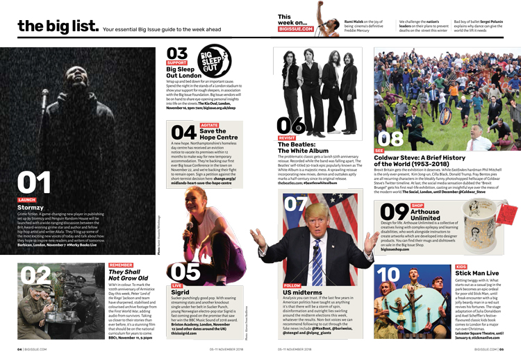
There are three distinct sections in the new design: news at the front, features in the middle, then culture at the back, which includes art, film, books, food, travel and music.
New series include The Big List, a section explaining 10 things happening that week, specific to the region in which the magazine is distributed. This section is quite “flexible”, says Lesley-Bayne, with the scope to move text and imagery around rather than be templated.
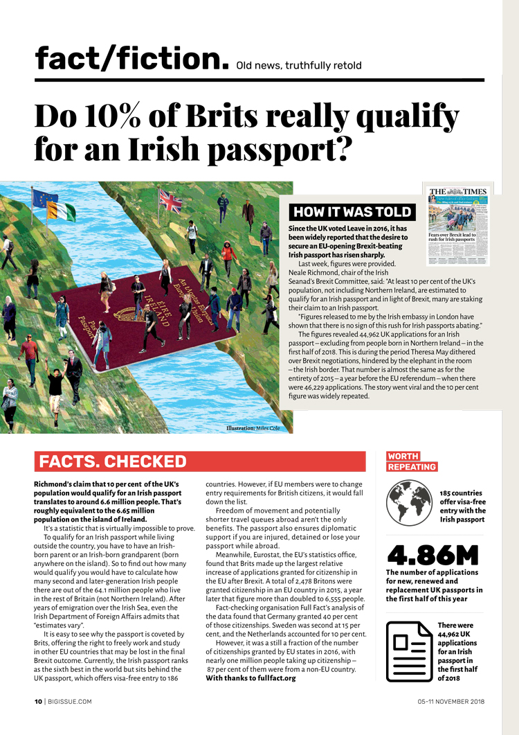
Another new feature is a news page called Fact/Fiction, which looks at a recent big news story, and lays out the facts behind it to establish how true it is. The launch issue kicks off with an analysis of whether 10% of British people do actually qualify for an Irish passport. Illustrators have been brought in to create imagery and infographics for this page to stop it becoming “dry”, says Lesley-Bayne.
One new section looks to place a greater emphasis on the vendors who sell the magazine – the Vendor City Guide is a new travel feature, which features explainers on cities across Europe and the world, as told from the point of view of vendors who live and work there, kicking off with Copenhagen in Denmark. Leeds-based illustrator Taaryn Brench was commissioned to design maps for each city.
“[The vendors] have such a unique voice and view of the city, from their favourite places to get coffee to where to get the best views of the city,” says Lesley-Bayne.
The Letters page has also been expanded to make readers “feel more involved”; it pairs up with the Big Issue’s social media platforms, a topical and perhaps localised question will be asked online every week then the answers will be printed in the magazine.
Lesley-Bayne says that, because the target audience of the Big Issue is so wide, rather than confined to a particular age, gender or any other demographic, the scope of the magazine has to be broad and attempt to “engage with everyone”.
“Our target market is anyone who’s interested in magazine culture, and society in general,” he says. “A big part of this redesign was changing perceptions and showing that this is not just a magazine about the homeless – we do features, culture, music and film reviews, we do hard-hitting cover stories, and more light-hearted cover stories. Hopefully people can find something they like.”
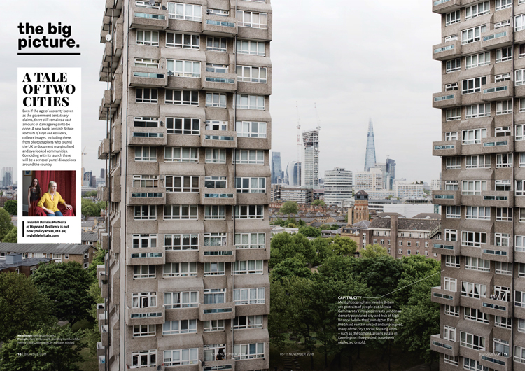
In general, the new design allows much more space for images and illustration and tries to rid the magazine of its former “text-heavy” demeanour, he says. A Big Picture feature has been added right in the middle of the magazine to emphasise this shift.
Four typefaces have been used throughout, two for headlines and two for body copy. Sans-serif Rubik and serif Play Fear have been used for headlines to create a “contrast”, while again, sans-serif Alegria has been used for news and features at the front, and serif Alegria is for arts and culture near the back.
“The bold, sans-serif at the front gives a sense a urgency and clarity to the content, while the lighter serif at the back gives people time to sit back and engage with those sections at a more leisurely pace,” says Lesley-Bayne.
The three main sections have been made more distinct through using a bold font style near the front of the magazine, and a thinner, lighter style near the back. The culture section also has a coloured background, differentiating it from the features section and “helping it stand out from ads”. The features section is the “most creative”, with no templates, and more freedom with text, illustrations and imagery.

The biggest changes have been made to the inside of the magazine, but the cover has also been tweaked. The masthead has been “tidied up”, Lesley-Bayne says, and is now bigger so that it is “more instantly recognisable on the street”.
There are less coverlines, bigger imagery and bolder colours, while the price, issue number, date of release and the magazine’s strapline “a hand up, not a handout” have been grouped together with the mast-head, reducing the amount of text visually.
“Basically, we wanted to clean the whole thing up and give it as much space as possible, while making the type as readable as it could be, and improving navigation so readers know exactly where they are within the magazine,” Lesley-Bayne adds.
While aiming to entice new readers to the magazine and raise awareness of the broad range of content that the magazine features, of which people may be unaware, the redesign also hopes to pay homage to the people it is trying to help, says Lesley-Bayne, by giving more space in print to the vendors’ voices.
“[The vendor selling structure] gives people an opportunity to work, who might not have that opportunity at all otherwise,” he says. “It gives people a sense of purpose and enables them to get up and engage with other people every day. Many vendors go into education and full-time employment afterwards. We wanted to put their unique voices into the magazine.”
The redesign has taken roughly 10 months to complete, and launches this week with issue number 1,332, on the centenary of the end of the First World War. For more information, head here.


Hi, I was an art director and designer for more than fifteen years in London, I used to walk through Soho and see homeless everywhere going to work. I helped quite a few and I continued seeing it for years…When the recession happened I started to move away and travelled, I never saw that in any of the countries I visited and I thought “how can they call this, one of the best Capitals in the world? I travelled to Asia, to South & Central America, I never saw this!!! I still don’t feel safe enough to come back because now there is knife crime & it’s a dangerous place! But the Country leaves all the empty buildings empty & doesn’t provide safety at least for its citizens at night! I never saw that in the streets I have been since! PureLove to all X But you still think the wars are valid and poison your citizens with that idea and most of them have become brainwashed & dying on the streets! Great Capital. PureLove to all the true souls out there!
Always good to see great editorial design. One of my favourite subjects. Think Big Issue should be proud of this and it should hopefully encourage more people to buy it.