
Chocolatier Cocoa Jones reveals culturally diverse branding
The packaging and identity of the new luxury chocolate brand features a mix of colourful patterns to represent the Pakistani and Nigerian heritage of its two founders.
Supple Studio has designed the branding and packaging for new chocolate brand Cocoa Jones, which look to represent the different cultures of the company’s two founders.
Cocoa Jones is a family-run company that was founded in 2017 by husband and wife, Michael Ogazi and Naz Khan, who are Nigerian and Pakistani respectively.

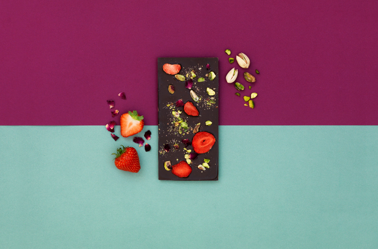
The chocolate brand opts for complex flavours, featuring many ingredients within one bar, such as pistachio, strawberry and rose dark chocolate, and mango, coconut and lime white chocolate.
The design studio decided to create a monogram for the logo that shortens Cocoa Jones to “CJ”, and packaging illustrations that symbolise the coming together of both ingredients and cultures.
The logo is composed of the “swirly CJ monogram”, says Phil Skinner, design director at Supple Studio, used alongside the brand name, set in a serif, all-capitals typeface underneath.

A variety of packaging illustrations have been designed to represent the “experimental flavour combinations” of the chocolate, he adds, with two distinct patterns on each bar, separated by a black panel in the middle, where the logo and ingredients are embossed in gold.
The illustrations have been inspired by traditional Islamic and African patterns found on textiles, again referencing the founders, and look to “bring together two cultures on pack”, says Skinner. The colours and abstract shapes used also look to reference the ingredients contained within each bar.
The packaging range has a broad colour spectrum of various shades of pink, red, purple, blue, green, orange, yellow, black and white, alongside gold for type.

Skinner says: “We wanted the bars and brand to feel premium, as this is a small-batch, hand-crafted product, but also colourful and full of character.
“The range has a great deal of flexibility and variation to encourage discovery, while also clearly belonging to the same family.”
The branding is now rolling out across chocolate bar packaging on-shelf, gift packaging and shop bags, print advertising materials and business cards, and online platforms including the company website and social media.


Bright coloured patterns on chocolate bars? Everyone was doing this 5 years ago, and it even then it was starting to look outdated. I think a great opportunity was lost to do something a bit more original, instead of just following the market and looking like a brand thats lost in a sea of other patterned brands.
When you adopt a strategy that’s no different to what the supermarkets are doing for their own label chocolate packaging, then sadly you’re doomed to fail. A real opportunity missed.
Brown wax paper, coloured belly band, bit of foiling for copy, BOOM, rebrand done!