How graphic design is getting people excited about medical research
The Pears Building is a new research centre for immunology and will open in London in two years – 70-metre-long, colourful, graphic hoardings have been installed around the building site to teach the community about the possibilities and benefits of cell research.
Design studio To The Point has created graphic hoardings to go up in London to educate the public about a new medical research centre, as well as encourage young people’s interest in science.
The Pears Building will be a £42 million immunology facility, built next to the Royal Free Hospital in Hampstead, North West London, and is due to open in Autumn 2020.
It is a collaborative project, funded by a mix of public and private sources, including the Royal Free London NHS Foundation Trust, the Royal Free Charity and University College London (UCL), charity the Pears Foundation, and local residents and organisations.
The centre, officially called the UCL Institute of Immunity and Transplantation, will focus on humans’ immune systems, and look to develop new treatments for conditions such as leukaemia and diabetes.
The research will focus on individuals’ genomes, in a bid to develop bespoke treatments for people, rather than generic treatments given to everyone with a particular disease. Scientists in the centre will work alongside clinicians in the neighbouring hospitals.

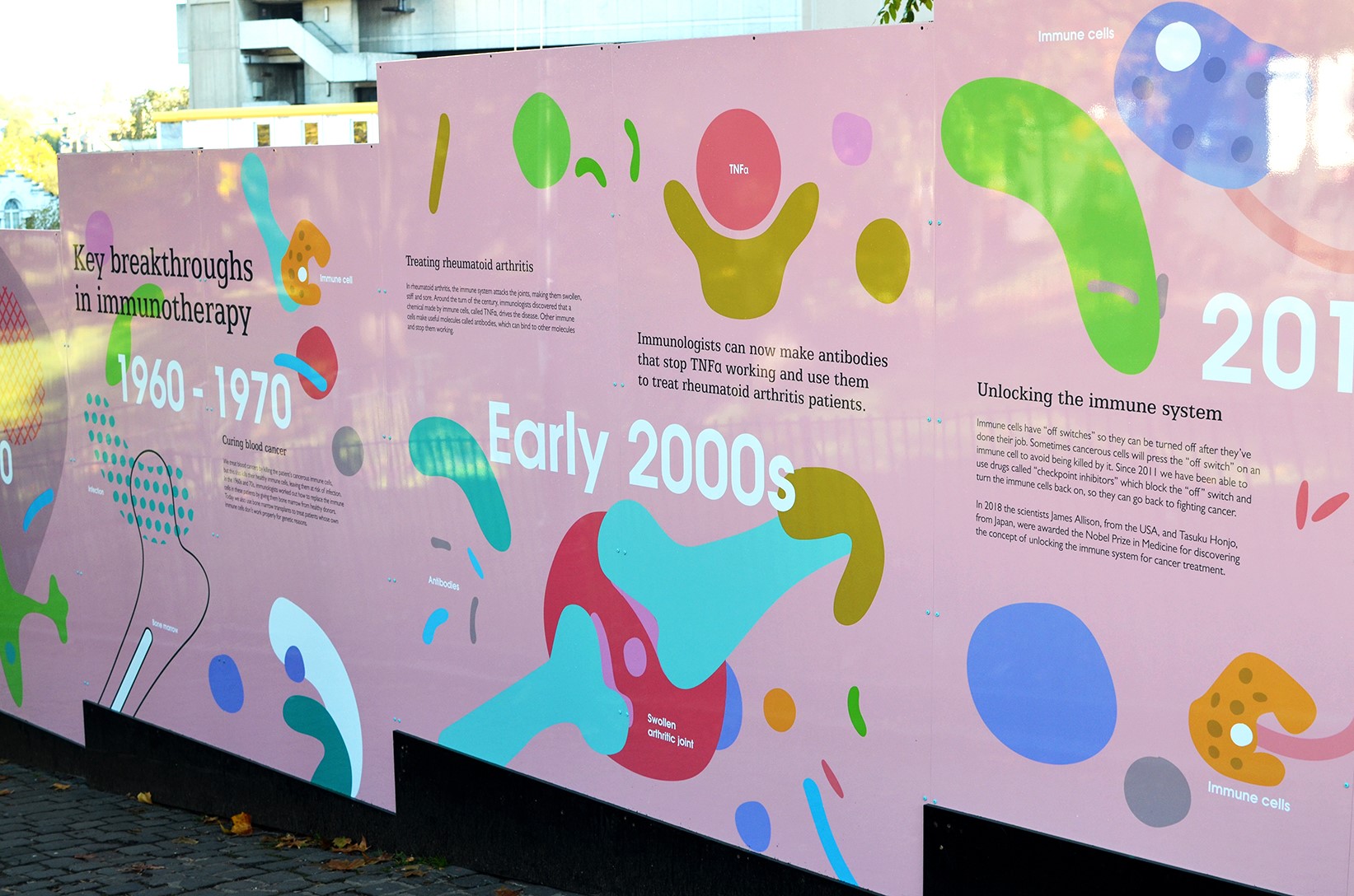
To The Point has designed 67 graphic panels that stretch across 70-metres, which is the circumference of the future building.
The hoardings are split into four informative sections: the science behind immunology, the building, a timeline and history of immunology and a community section that includes illustrations, drawing and comments from the local public, including children from Fleet Primary School in Hampstead.
Since going up, the hoardings have “created quite a stir” with many people stopping to read them, says Kevin Cox, creative director at To The Point, which is the whole point of the project, he adds.
“Our remit was to engage with the community, by informing them of what’s coming while educating them about the groundbreaking work that will take place there,” he says.

He hopes that the graphics will help to tackle “scepticism” surrounding genetics-based medical research, both with regards to its extent of use and its cost.
“When people think of stem cell research, they automatically think of Dolly the Sheep, cloning, and designer genetics,” he says. “They focus on where this technology is being taken and how it could be abused. But research like this could be really beneficial to society – most scientists would agree that [immunology] has opened up a whole new arena where things there were previously untreatable have become treatable.
“Where people used to produce medicines by the millions to treat generic disease, this centre focuses on particular people and pinpoints specific things that make people ill,” he continues. “The problem is, these medicines then become very expensive. That’s what this centre will focus on – as the technology advances and becomes more commonplace, costs will start to come down, and it will become accessible for everybody.”

The hoardings are pastel shades of pink, blue and purple, with many colourful graphic shapes representing cells, chromosomes, viruses, antibodies and other scientific elements, used alongside large-sized, succinct text in a mix of sans-serif typeface Gill Sans and serif Egyptian. This is used alongside photography, and illustrations, some of which have been created by the community.
The colourful design aims to entice people to read the hoardings, and also encourage young people to take interest in science and careers in the sector.
“We’ve tried to immerse people in the immune system with the design,” says Cox. “They become lost in a globular, cellular environment. We’ve presented it in a playful nature and haven’t spoken too much about specific medicines or technology, but are instead talking to people emotionally. We want to get young people on board and generate the scientists and engineers of the future.”
He adds that the studio steered away from the Royal Free Hospital’s “rigid purple-and-white colour structure” and opted for a broader, pastel palette to help the hoardings feel “approachable” rather than “corporate”. The mix of sans-serif and serif typefaces aim to allow “flexibility and contrast” in how text is presented.

He also says that the information on the hoardings was broken down into “bitesize pieces”, with a mix of “technical and light-hearted stuff”. The studio worked with medical professionals and scientists to gather the information, by asking them to provide the studio with only two or three key points related to their area of speciality, with the studio then putting these in “lamens terms”.
“We tried not to overly complicate it,” says Cox. “The objective of this is to promote the building but also bring immunology to the fore. We wanted it to feel playful and make it something that people genuinely want to read.”
The hoardings are now up in Hampstead, London, next to the Royal Free Hospital, with the new centre for immunology due to open in 2020.


Lamen’s terms?
Hi Jamie,
Our core readers are designers, not scientists – so yes, sometimes we need to put other topics in layman’s terms to make them more accessible.
Thanks,
Design Week team