Deliveroo unveils new kangaroo as part of rebrand
The takeaway service has been rebranded by DesignStudio, which has been working with the company for a year and has created an angular new kangaroo, designed to be internationally recognisable.
DesignStudio has rebranded food delivery service Deliveroo, introducing a new kangaroo character while overhauling typography and staff uniforms.
Deliveroo was founded in 2013 in London and has since expanded to 12 countries and more than 100 cities.
Old logo designed by friends
The original logo was designed by friends of Deliveroo co-founder Will Shu, who says that it was necessary to rebrand following the rapid expansion of the company as the identity now needs to work a lot harder.
Shu says that when Deliveroo started out he did the deliveries and his co-founder and childhood friend Greg Orlowski handled the tech and development.
“Our customers were my ex colleagues and our office was my flat. Back then, our logo was something that a couple of friends drew” says Shu.
The original brand was designed with the Deliveroo website, rider boxes and business cards in mind. Since then advertising campaigns have been launched and the most visible part of the brand has become the thousands of riders who work for the company.
DesignStudio rode Deliveroo bikes
After a pitch process DesignStudio was selected and in its research phase took part in customer service shifts, became riders and according to Deliveroo’s in-house design team “ate enough to get a sense of what restaurant delivery really means.”
DesignStudio’s semiotics analysis focused on what the Deliveroo logo meant in other cultures and countries while workshops across the business considered where staff could see the identity being used in the future.
A range of different routes were initially worked on, some of which kept the kangaroo, while others looked for a new direction. As part of the wider process it was established that the kangaroo was loved both internally and externally, according to Deliveroo’s in-house design team.
A new “bold and impactful kangaroo” has been developed and made deliberately angular so that it can dovetail with a broader graphics system across other touchpoints such as the website and rider kits.
“A symbol recognised as a character”
DesignStudio executive strategic creative director James Hurst says: “We have created a symbol that can be recognised as a character – the roo – irrespective of what language you speak while the minimalist aesthetic reduces established cultural associations that might be positive in one culture but controversial in another.
“This is a mark that Deliveroo will imbue with meaning over the next few years.”
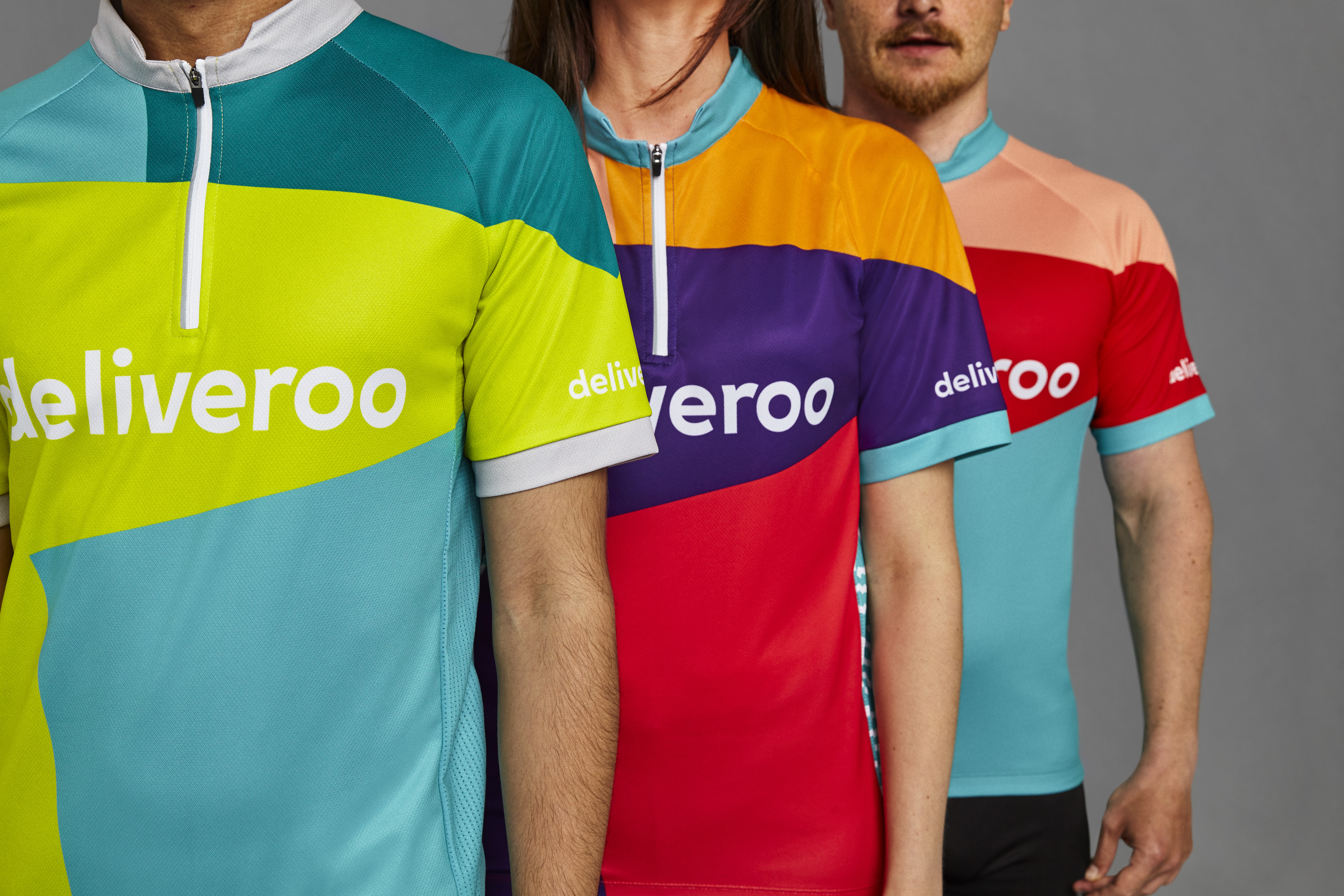
The rider kit has been designed with rider safety in mind, says Deliveroo, and developed in consultation with road safety organisation Brake and the riders themselves so they feel happy wearing it.
There is hyperreflective material on the waist, shoulders and wrists of jackets to demonstrate the movement of riders at night while the rest of the material has been designed to be visible by day.
Meanwhile riders in warm climates wanted to be cool and riders in cold climates wanted to be warm and protected from the elements so this has all been accounted for with a range of clothing.
Typographic direction
Typography also takes its cue from the angular “roo”, particularly headlines which use a customised version of Stratos, “which echoes the angles and shape within the symbol and is brimming with personality for bold punchy headlines,” says Hurst.
He adds: “Its the same type used across the rider jackets and while its been worked into, is also the basis for the wordmark.”
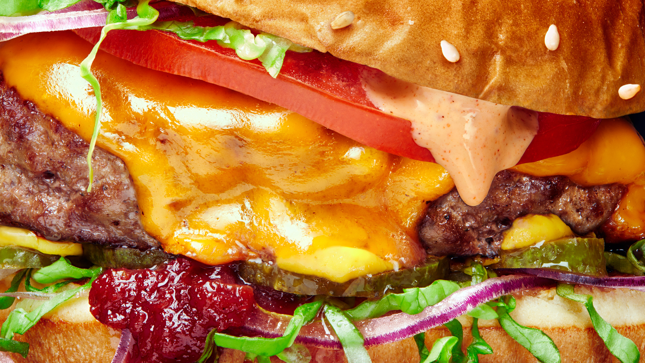
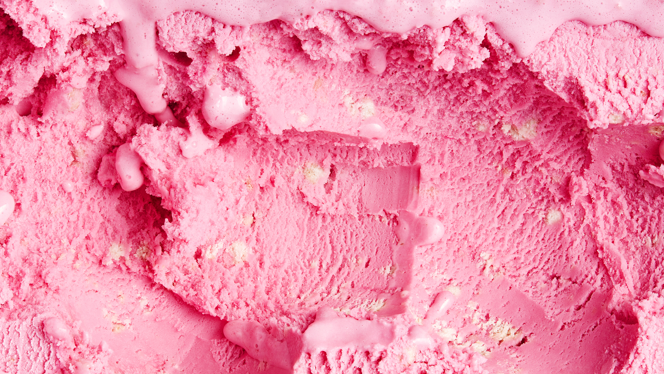
A photography style has been developed across the brand, which focuses on the colour and texture of food and this has been art directed to appear real, messy and up-close, according to Deliveroo.
A roll out begins this Friday and Hurst says: “There is much more still to come.”


Literal two fingers to Uber Eats?
I normally applaud good branding but in this instance with the sort of company they are and their recent press coverage, I wonder what the point of a rebrand is and who it is going to appeal to or what difference it actually makes? I simply want the riders to wear hi vis jackets so that they are safe on the road and I don’t collide with them.
Now i can be flipped off every time my food arrives !